So just to give you a little background, project 4 was to be my own creative project. I settled on a web platform similar to Sprout Social, but more geared toward content creation, with an emphasis on large-format content (mostly of the music/video variety).
I had to create a project booklet to present to my teacher, so everything you read below the logo will just be copy taken from that.
Without further ado, take it away, me…
The Basic Idea
Do you manage several social media accounts for your business or brand? Or maybe you’re a content creator (video, audio, etc.). Managing a lot of accounts plus content uploads can get tedious, especially if constant fan interaction is important to you. Just as important are the analytics, measurements of how effective your audience outreach and content releases are. But what if you could manage and schedule posts and content releases over multiple social media platforms, as well as track the effectiveness of this content using one tool? Enter Rockbase.
User Research
The very first form of research I did was not the best one, but it helped me understand my own goals a little more. I talked to the manager of a local rock band. She explained that since she’s the principle poster for at least three bands, it’s difficult for her keep track of every network she has to cover when talking about shows or new albums. She probably represented my target audience.
I also talked to a bunch of friends in bands, some of whom had managers and others serving as their own managers. When I brought this idea to them, the concept was one of intrigue. Maybe I had tapped a market.
The next step was to build a survey. Once I had this, I distributed it amongst my friends, as well as my UX classmates at NYU Poly. This led to a very diverse set of people, not all of whom were musicians or managers (in fact, a little less than half).
In the end, I had 24 responses. Some of the more interesting points of information from the survey…
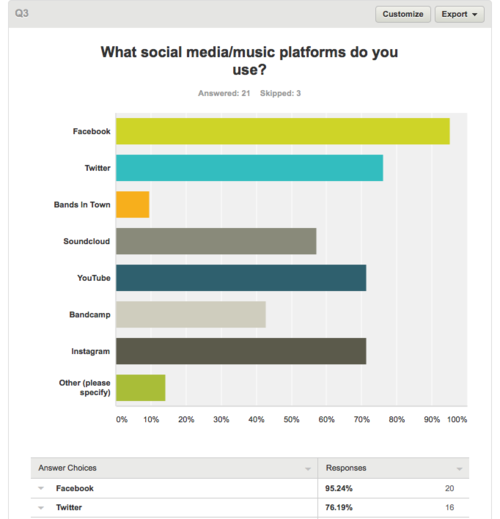
- 95% of respondents regularly use Facebook, although it was not specified if that was for personal or band use.
- Instagram and YouTube were tied for most popular content distribution platforms (each coming in at 71% of users), while a little over half used Soundcloud. As the use of platforms is not mutually exclusive, I’d assume there’s a bit of overlap, especially with those who create content.
- Of the non-musicians who answered the survey, I got a few theater and film people, making all types of performers a good target market for this app.
- The most popular way to spell “Rock” in a music context is Röck. Meanwhile, in a wrestling match between Lemmy and God…actually, trick question, Lemmy IS God.
Paper Prototypes and First-round User Testing
While compiling the results of my user survey, I also decided to sketch out a few different pages of what I hoped the app would look like. Since I hadn’t drawn out every single clickable possibility on the homepage, I had to explain to the handful of testers what each function did.
Probably the single most important omission I had to correct was the absence of a sign-in feature, as well as the lack of analytics and account management, all features that would arrive in the interactive wireframe.
Iteration 2
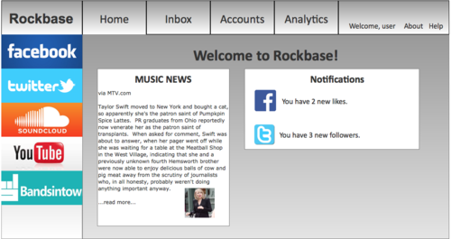
I moved over to Axure to build out my prototype for Rockbase.
That’s the main sign-in page.
After several lunch breaks at work spent hunkering down over the laptop, I got to a place where I was comfortable testing it out. So I mailed it out to a few friends, got some of my classmates and coworkers, and eked out a decent sample of users (all-in-all, 10), not just musicians, but different kinds of performers who could use Rockbase to manage their media.
User Testing, round 2
As stated above, I started out user testing with my musician friends. However, when I couldn’t get enough responses, I turned to my classmates at NYU Polytechnic. Luckily, the cool thing about the Integrated Digital Media program is that several of the students are also performers, putting them right into my target audience. Here were my findings after round 2:
- Initially, I was linking directly to a “create new post” page for each network, instead of a dashboard with all of their statistics. My co-worker, Mik, pointed this out, and my response was to mock one up, that links to the analytics and scheduled posts.
- My classmate, Lauren, pointed to several superfluous buttons, many of which were redundant and confusing. Those were removed in favor of one-step selection.
- Several expressed desire for support from platforms not included in the prototype, like Vimeo. Additionally, as one of the testers was a photographer, he wanted something that could post to his Tumblr. I’ll have to see if the API can support an app like Rockbase.
- Believe it or not, I did not include a sign-in function in the first iteration. The function now serves as a gateway to the other interactions in the prototype.
- Among my musician and management friends, the general consensus was that the app could be useful, once a few more functions were made obvious, like viewing fan numbers and growth (now a function of analytics), as well as being able to manage songs and videos from the app once they’ve already been posted (this includes functions like monetizing YouTube or tracking ticket sales via Bands In Town).
For the clickable prototype, check out…
http://4052jl.axshare.com/home.html
Otherwise, the next thing you’ll see is my portfolio.
What a semester, guys. See you on the other end.


