So as stated before, here are the deliverables for our project.
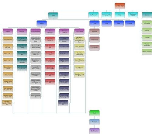
Sitemap:
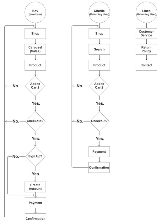
…user flows, presented nice and clean…
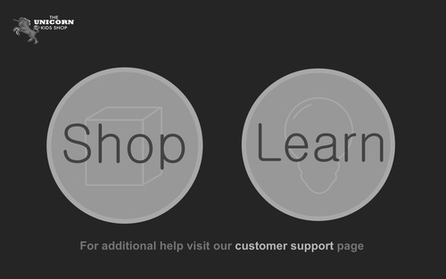
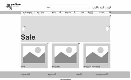
…and wireframes for Bev’s interaction.
Initial landing spot.
Main shop page.
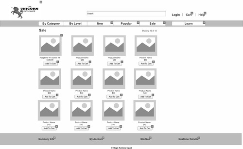
Items on sale.
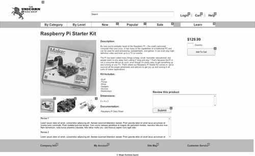
Product page.
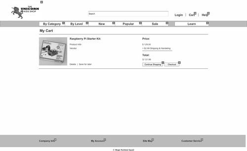
Cart.
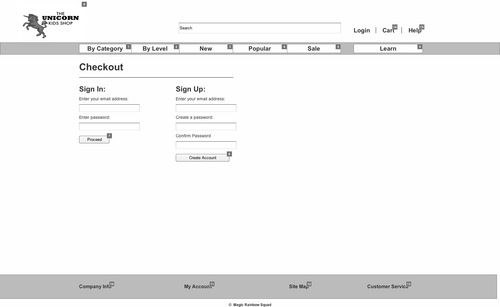
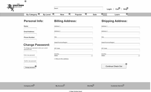
Account creation (Bev’s new here, you guys).
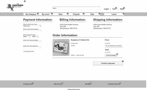
Payment information.
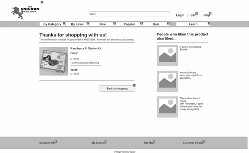
…and at the end of our interaction, a nice confirmation page that will take you back home.
The brave among you can interact with our prototype that not only has the interactive requirement for one user flow, but also includes some pages for the “Learn” section, and the information Linea wanted for customer service.
Interaction can be found at: http://saamuo.axshare.com
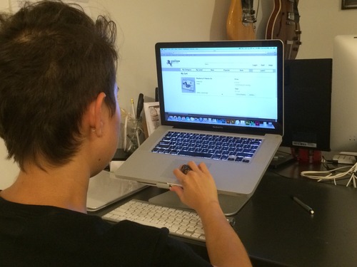
Like last night, here’s my girlfriend Cassandra working through the prototype:
Her notes:
Working as Bev, it’s pretty easy to navigate or figure out, not terribly different from any other online store.
The login button works kind of weird, doesn’t react to typing (Ernie’s note, a consequence of compressed time on working through the prototype).
I can’t leave a comment (Ernie’s note: ditto).
My boss at LaunchLM, Mikhail, also play-tested the site this morning, and had this much to say:
I’d like to be able to click on everything.
(upon hearing about the persona for whom the interaction was made) I don’t know, if I were a grandma, I don’t think I’d really care about looking cool.
I’d like to be able to scroll in the review screen without having to click on it first.
What’s going on with this login tab? (the interaction isn’t active on all headers for the prototype.
Finally, even though we are technically competing for the group that “kills it” (I think Dana Karwas has the trademark on that term), our classmate Sryia rounded out our focus group.
To this end, she really embraced being Bev, and had this to say:
-Would have liked to see the recommendations earlier and not just at the end of the confirmation
-Its good that you can add to cart without having to look at the product info page.
-As a 73 year old woman this site would have worked well for me.
The significant others of Dan (Erica) and Brigid (Brian) also tested the prototype, and quite a few suggestions, mostly aesthetic, made it into the iteration you see before you.
So I suppose this raises the question: Does this do what it’s supposed to? The answer is yes, you can go here and buy things, and sort them by categories built through association (I think I may have spent too much time reading the Media Studies homework).
“The show doesn’t go on because it’s ready; it goes on because it’s 11:30.”
- Tina Fey
It’s pretty easy for a first-time user to figure out how to buy something deemed cool or sale-worthy, and honestly, though I may have tweaked the aesthetics with more time, from a functionality standpoint, I’d say we’re in a good spot, and given the time constraints, that’s all I can really ask for.
The Magic Rainbow Squad (the original names were much worse) has run its course, and although I really liked working with these two, it looks like we’re breaking up the band. See you at project 3!
