Moving onto our user tests, well, here’s some pictures of that.
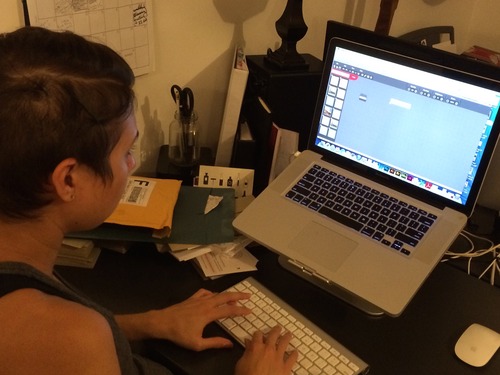
One of the first users I tested was Fallon, a programmer.
At first, she was having some difficulty with buttons not showing up. This was good to know, as it gave us some sort of idea that the window size can affect the visibility of some functions.
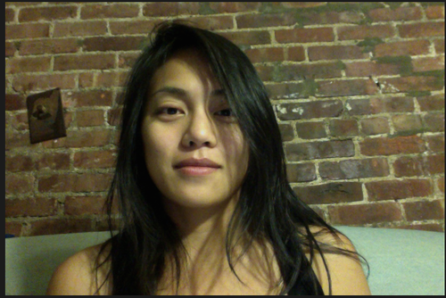
My fiancée Cassandra (a graphic designer) was actually the first person I tested, which goes back to an original iteration, when I showed her two prototypes based on both designs. I brought her back into the fold when we were more heavily testing the design we ultimately went with.
Her feedback had more to do with the fact that certain buttons that looked clickable were not, even the ones that were meant to be (in this case, check boxes for image selection).
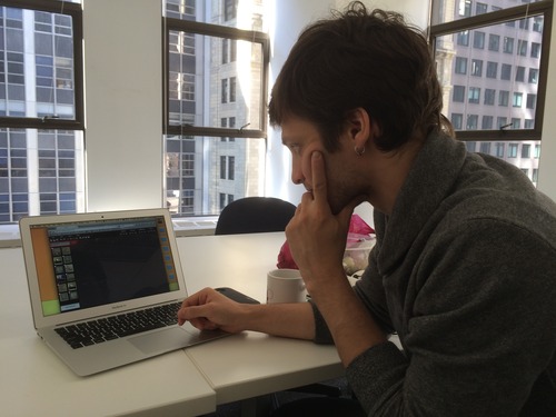
Scott (a General Assembly student) and Mik (an operations manager for Launch LM), below, had feedback relating to the absence of a crop tool, as well as the low visibility of metadata.
In addition to these users, the Dans ran user tests on their live-in SOs, and Donovan attended a few NYU events, in order to get some tests done with a student as well as professor in the museum studies department, who are very close to our target market for this.
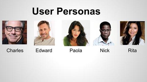
The user research, combined with our goals, yielded five distinct personas:
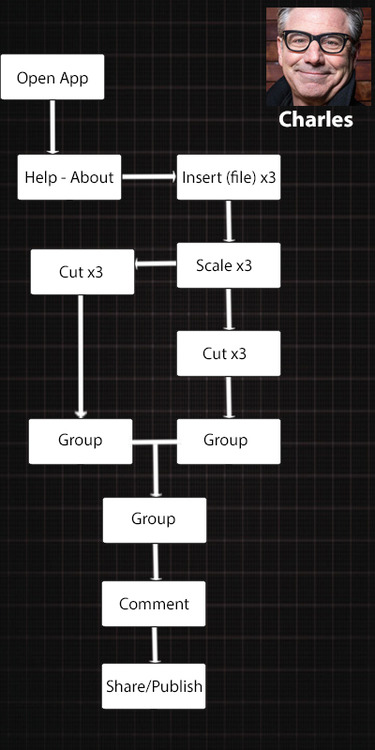
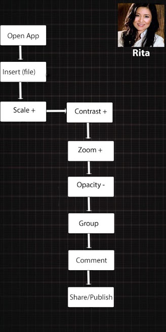
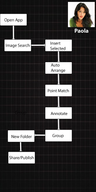
Each one in a different age group and professional background (details can be provided upon request). Once we had those down, we had to form a user flow for three of them, based on the functions of the tool (At this point, we were on something like iteration 4).
Once these were developed, we had the tools in place to start our presentation, which is a whole other ditty.
