Don't Call It a Comeback by Ernie Gerardo

Seven years is a really long time to go without blogging. But according to my analytics, there hasn’t been a huge audience for Ernie Gerardo content lately. So here’s what’s been happening between 2016 and now:

Actually, this was 2015, but images are good for SEO. Plus, that jacket is so awesome.

  • I planned my wedding

  • I worked as a production assistant for the 2016 Tribeca Film Festival

  • I met the guy who would become my employer for the next seven years

  • I got married

  • I worked for these guys, and I also worked for these guys on nights and weekends

  • I went to Paris

  • My friends got married in Puerto Rico

  • My sister got married

  • I got a dog

  • I officiated my best friend’s wedding

  • I went to Barcelona

  • I went to Iceland

  • My wife and I bought an apartment in Upper Manhattan

  • The world came to a halt due to a highly contagious respiratory disease

  • I got really into cooking and posting Instagram stories about cooking

  • I found out I was going to be a father

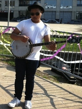
  • I joined a band

  • After three years of not really traveling, I went to New Orleans

  • My daughter was born


Yes, this blog and portfolio will now be mostly baby content.

  • I spent a good chunk of 2022 figuring out the next move

…and the rest is for a later post.

So what is next for this lovely website? In the coming weeks, as I prepare to move forward, I’d also like to look back, so maybe we can expect:

  • Throwback travelogues

  • A summary of my pandemic activity whilst in quarantine

  • Musing about the band I joined

  • Musing about how LinkedIn ended up being a more social app than professional one for me

  • Dog stuff

  • Baby stuff

  • Updates to my portfolio (yes, I did work on audio and video projects in my spare time)

So keep an eye out here, and you’ll start to see more stuff from me as I share career things, creative things, and general life things. Please enjoy these budget Muppet Babies celebrating my return to blogging, and I’ll see y’all real soon.

Better With You @ NYU Skirball by Ernie Gerardo

In the very specific world of family-friendly science-themed entertainment, you can't too much better than Doktor Kaboom. The guy stages larger-than-life versions of science experiments that entertain just as much as they educate, like a version of Bill Nye mixed with the Mythbusters' tendency to build things just to see how big an explosion they can make if they tweaked the parameters of an experiment to their logical extremes.

And he somehow does this in a manner that the kids just love.

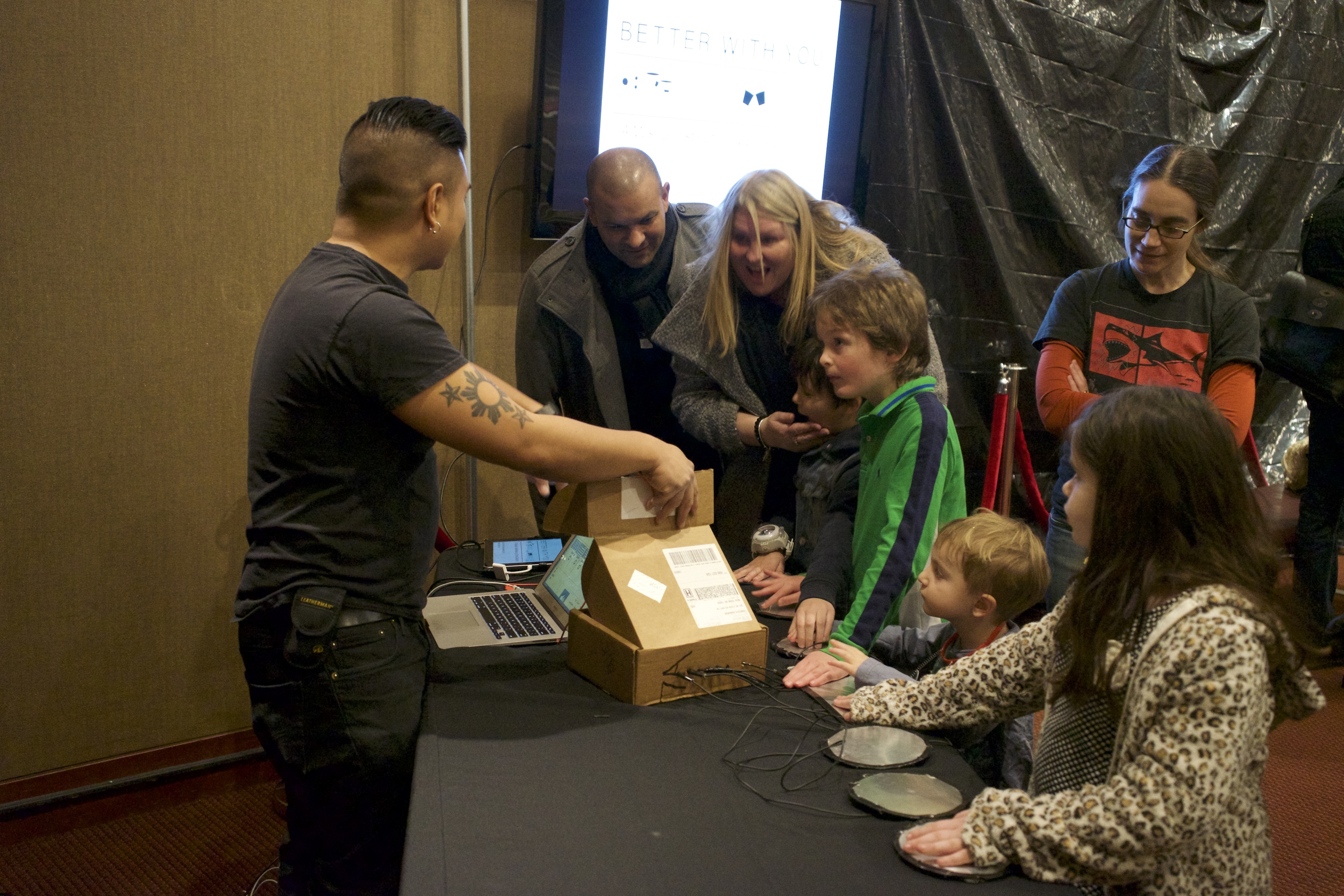
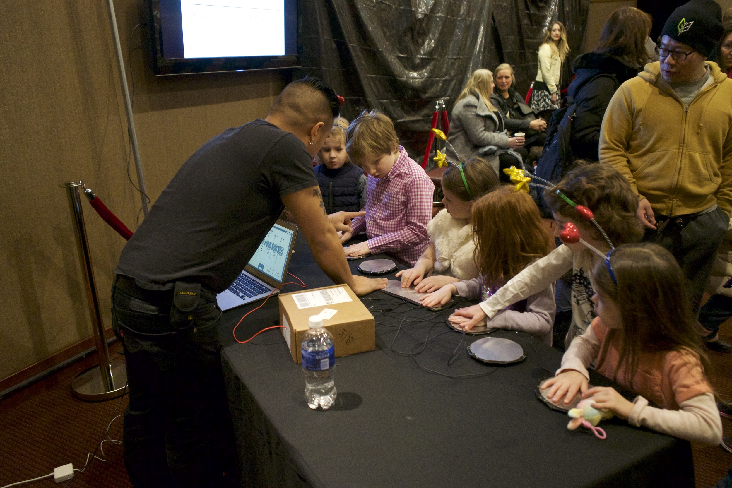
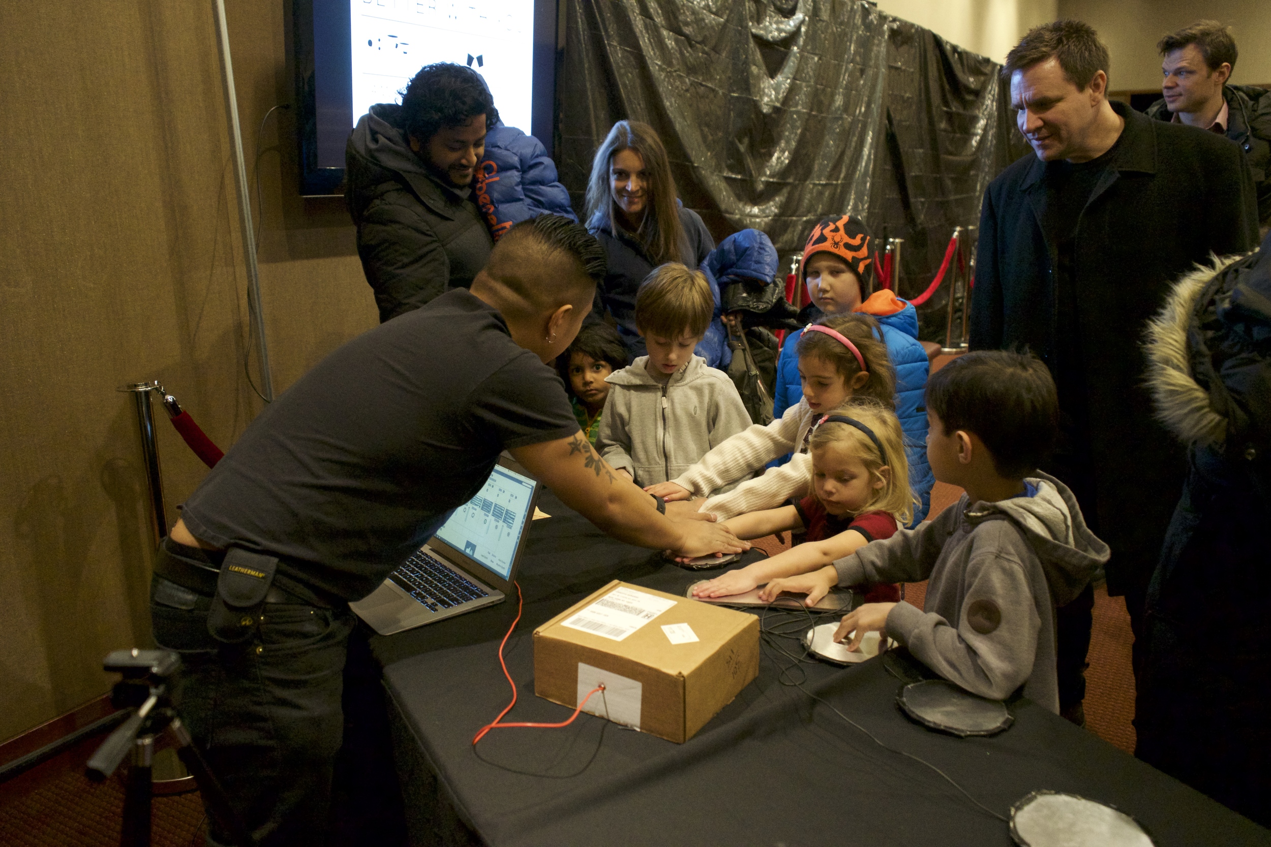
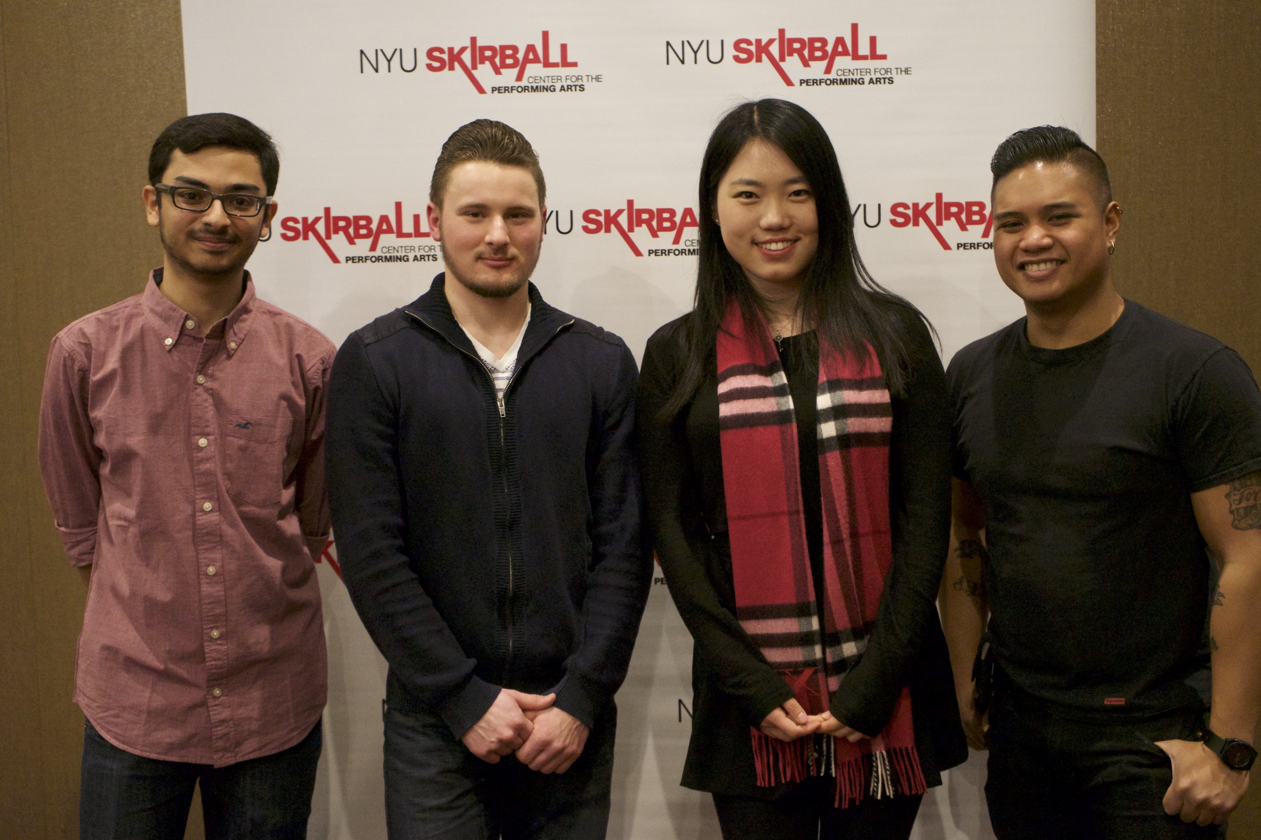
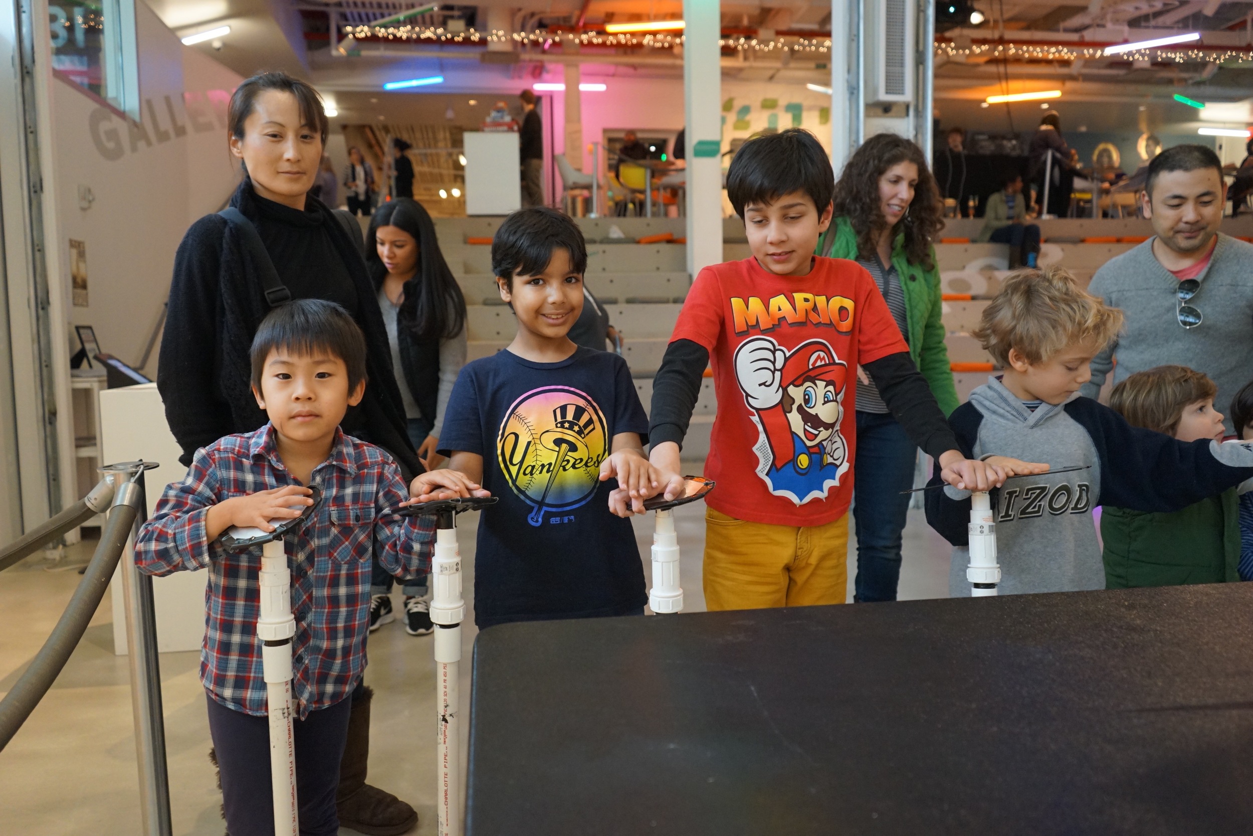
The theme of this tour was "Live Wire," where he'd do some cool experiments with electricity, including Tesla coils and Van de Graff generators. I had the opportunity to "open" for him when he came to New York with an hour-long pre-show activity in the lobby of NYU's Skirball Center.

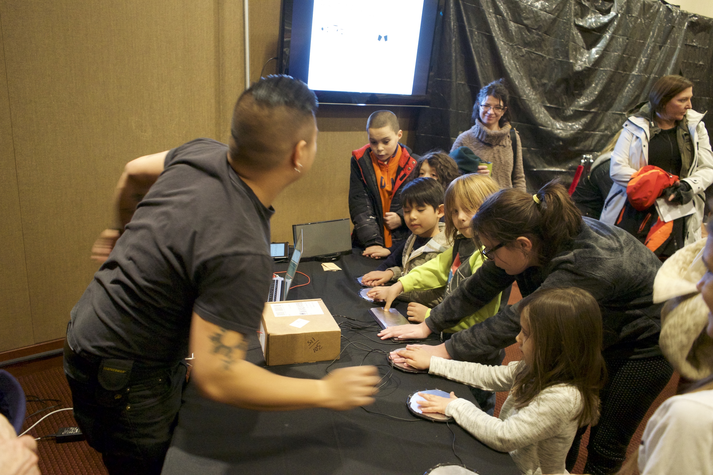
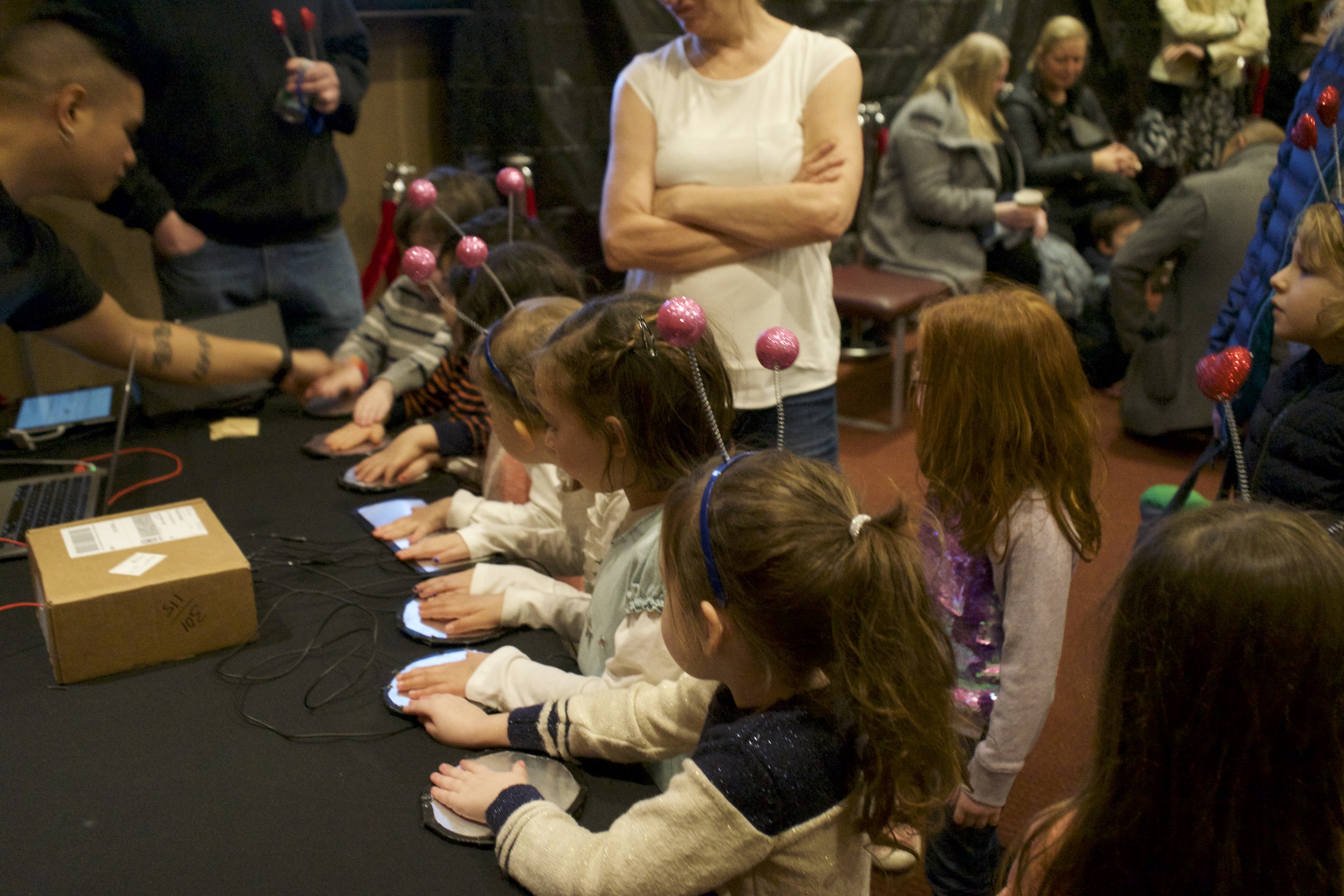
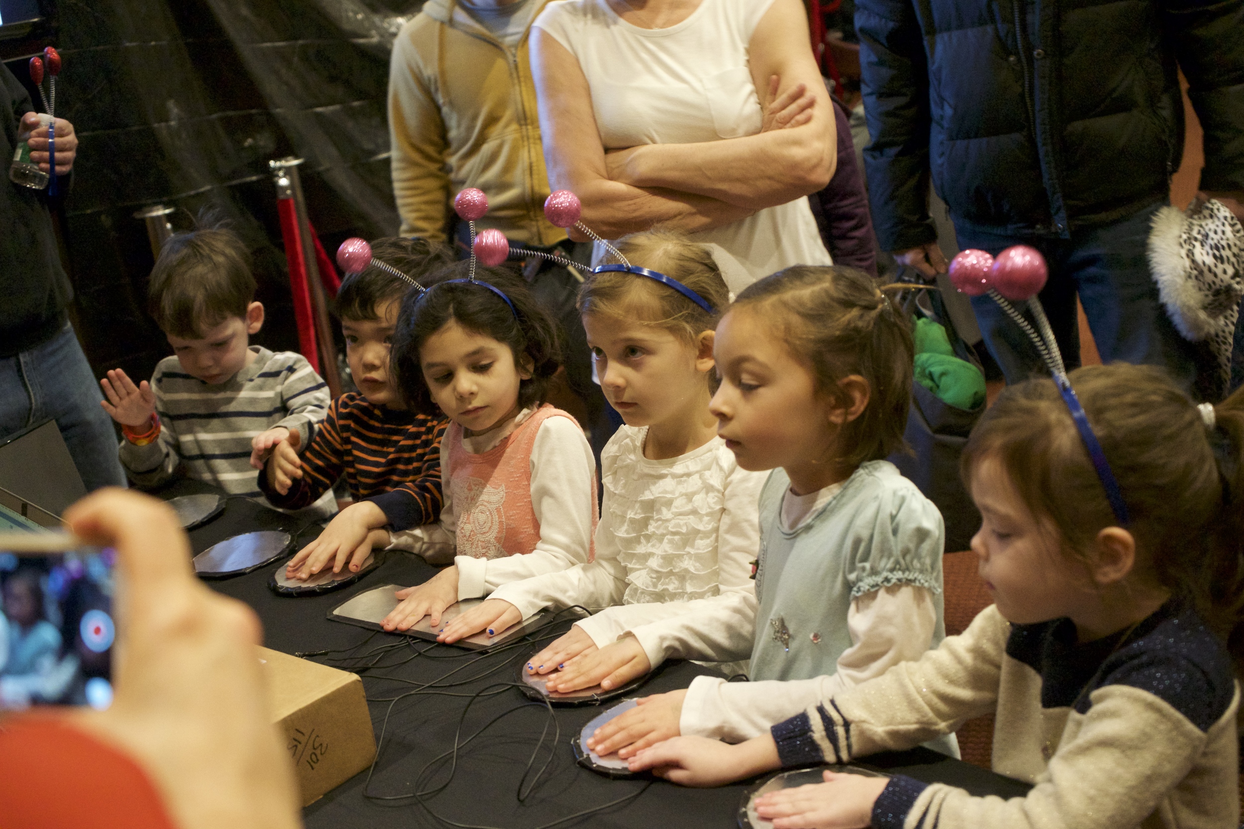
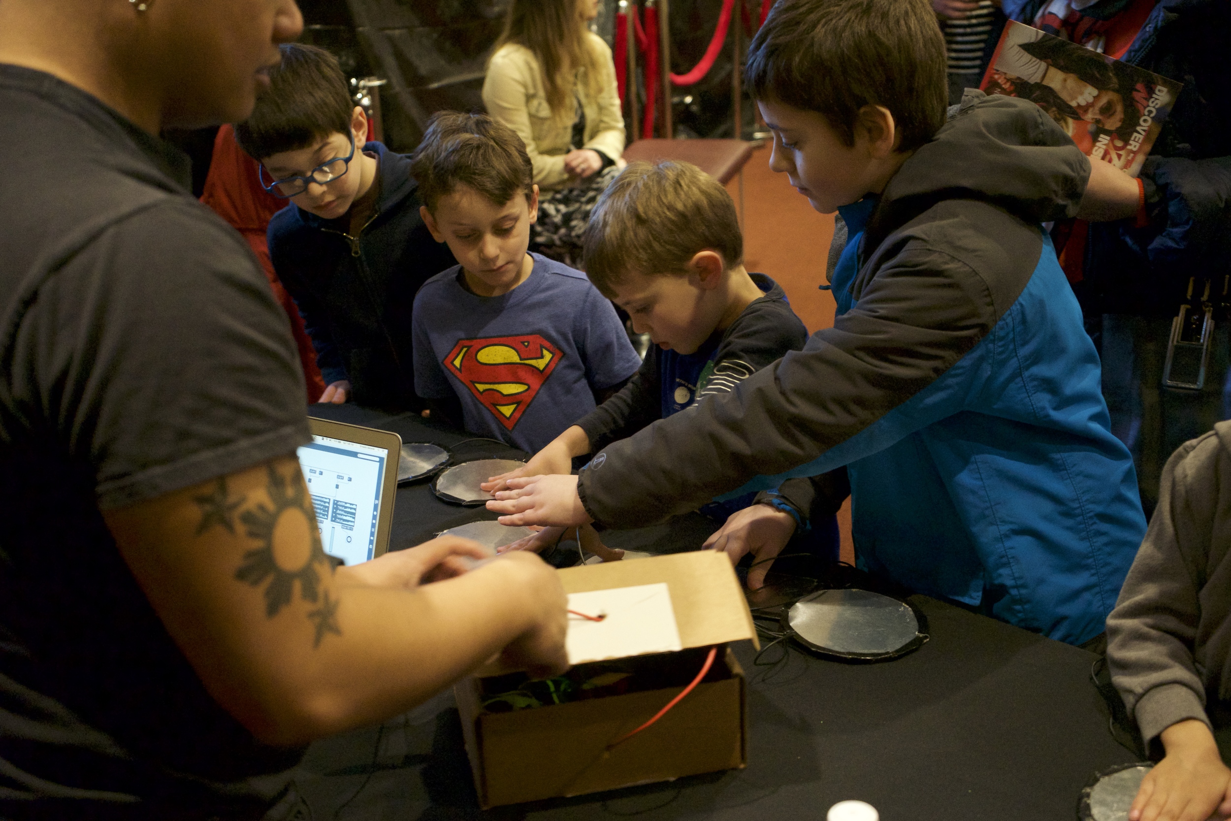
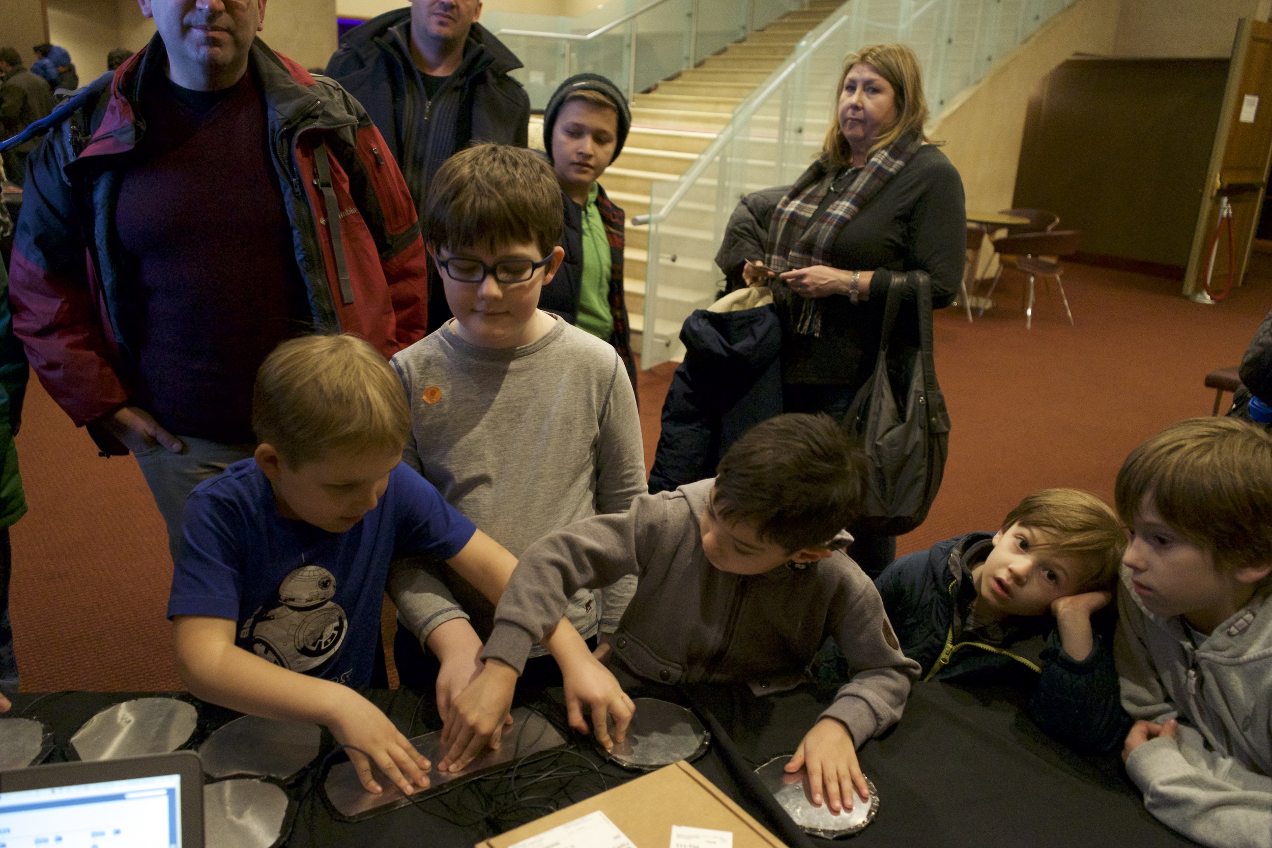
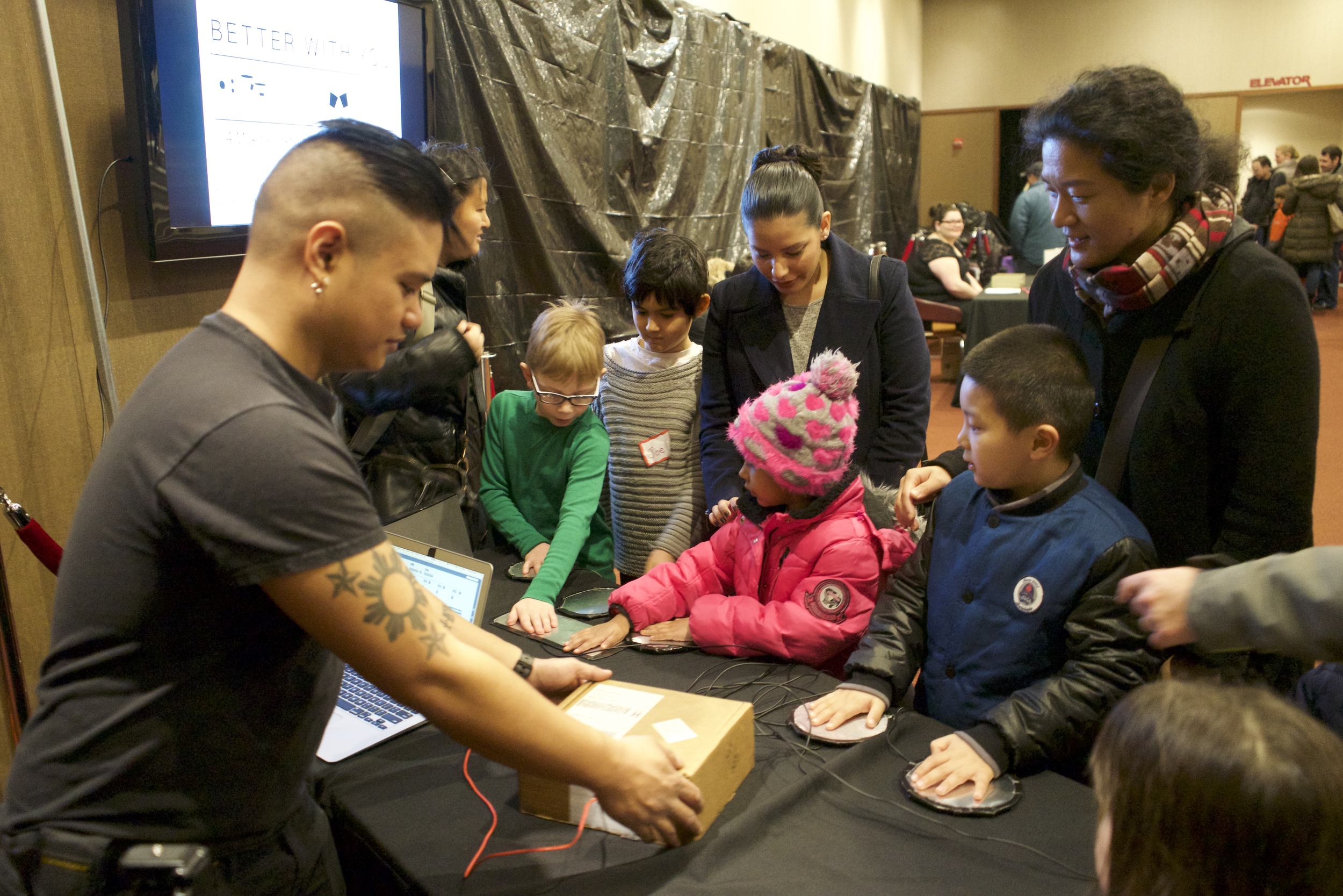
Unlike the BRIC event last month, this was less about conducting surveys (no time) and more about making sure this version of the build could withstand an onslaught of 100+ kids. And it did, actually by taking a step back design-wise.

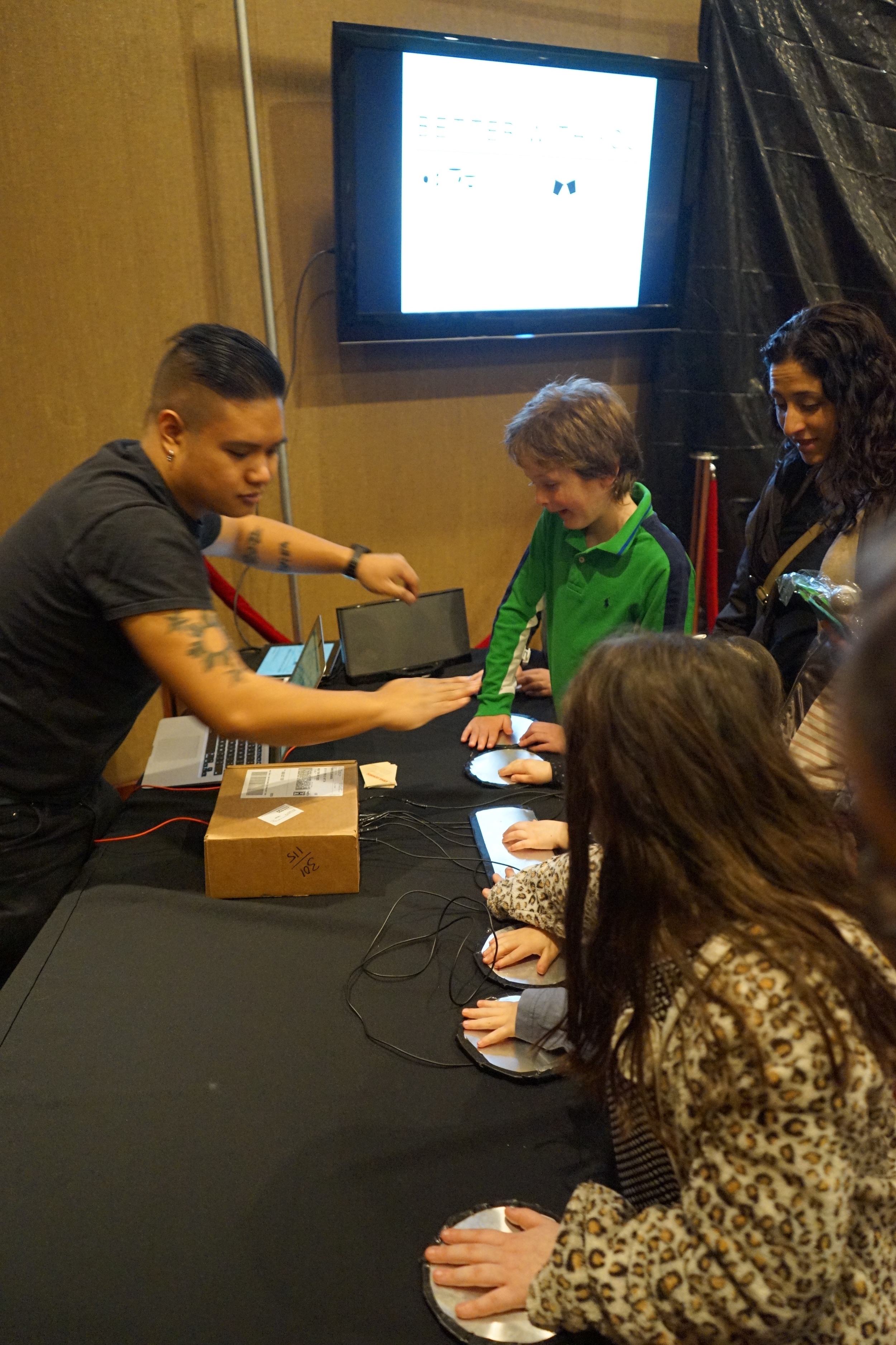
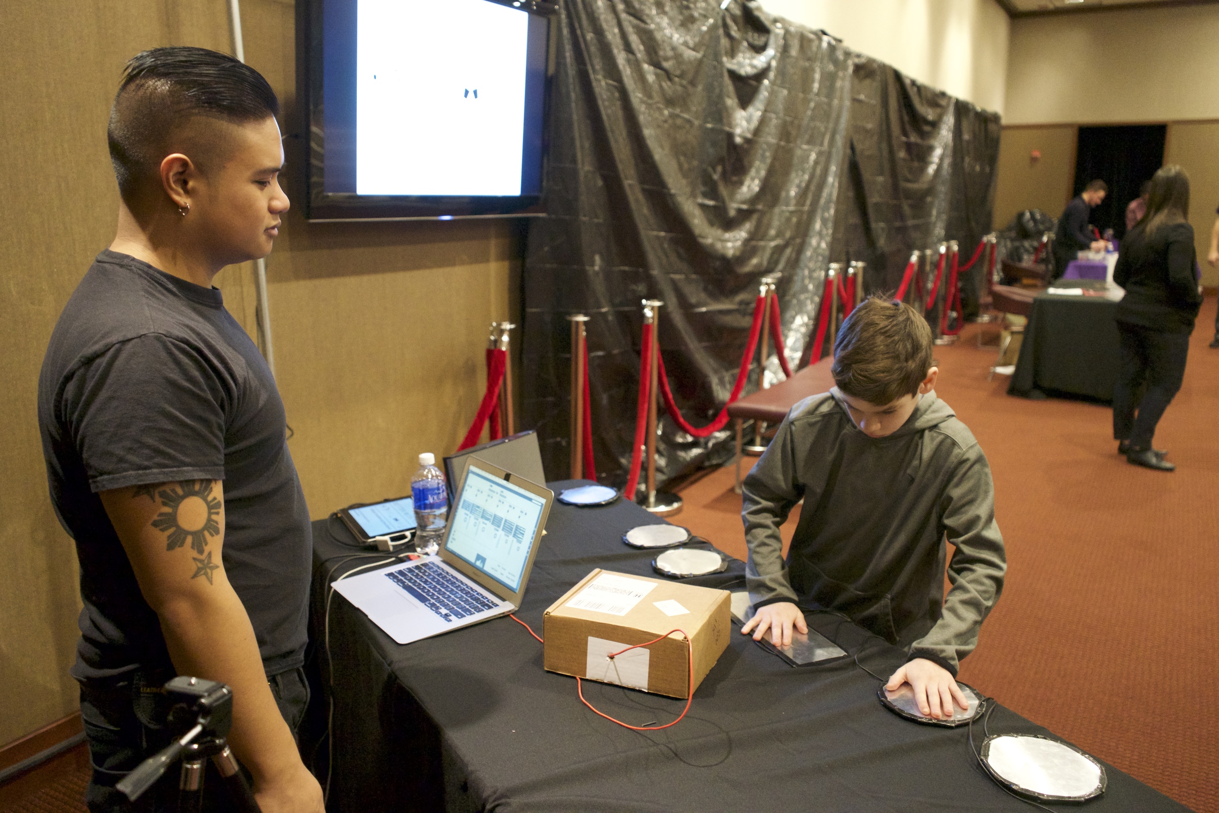
These plates were rewired while I watched Rick and Morty for like three hours.

If you look at this picture, you'll notice that I took out the delicate PVC stands and opted for a version that was super-reinforced with Gorilla tape, yet with enough surface area that a kid could pick it up and make it work.

I also experimented with thicker solid-core wire to prevent unwanted contacts from touching, as well as help with durability.

Someone call Mike O'Malley, because I'm spilling my GUTS.

Finally, I gave this thing a logo! Or at least a graphic I can use for demos!

If you arrange these symbols in a hexagram with the ground symbol in the center and then sacrifice an 808, you can summon Skrillex.

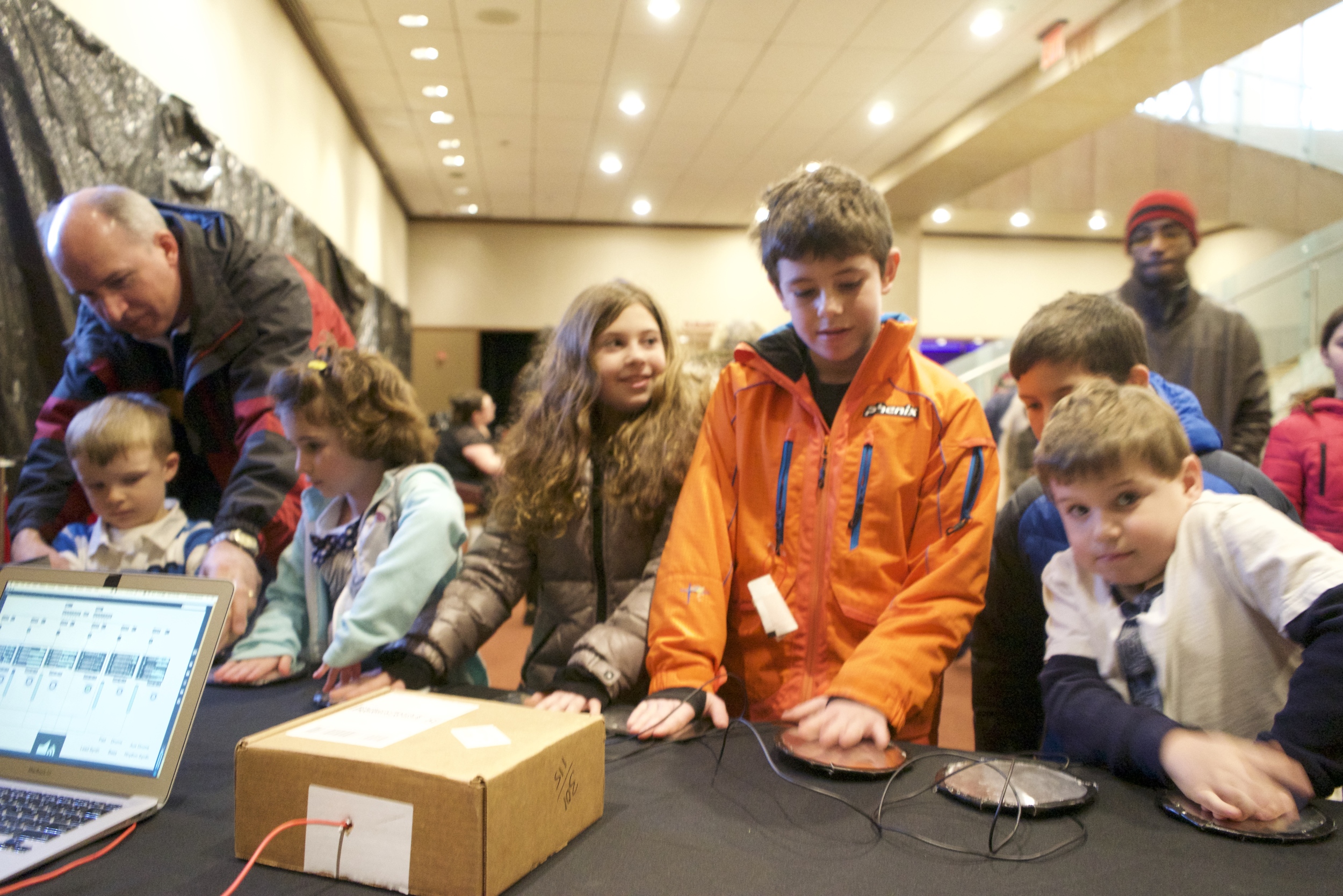
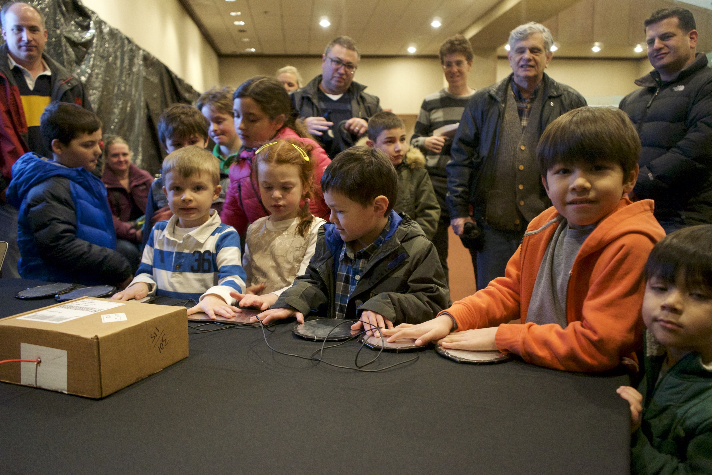
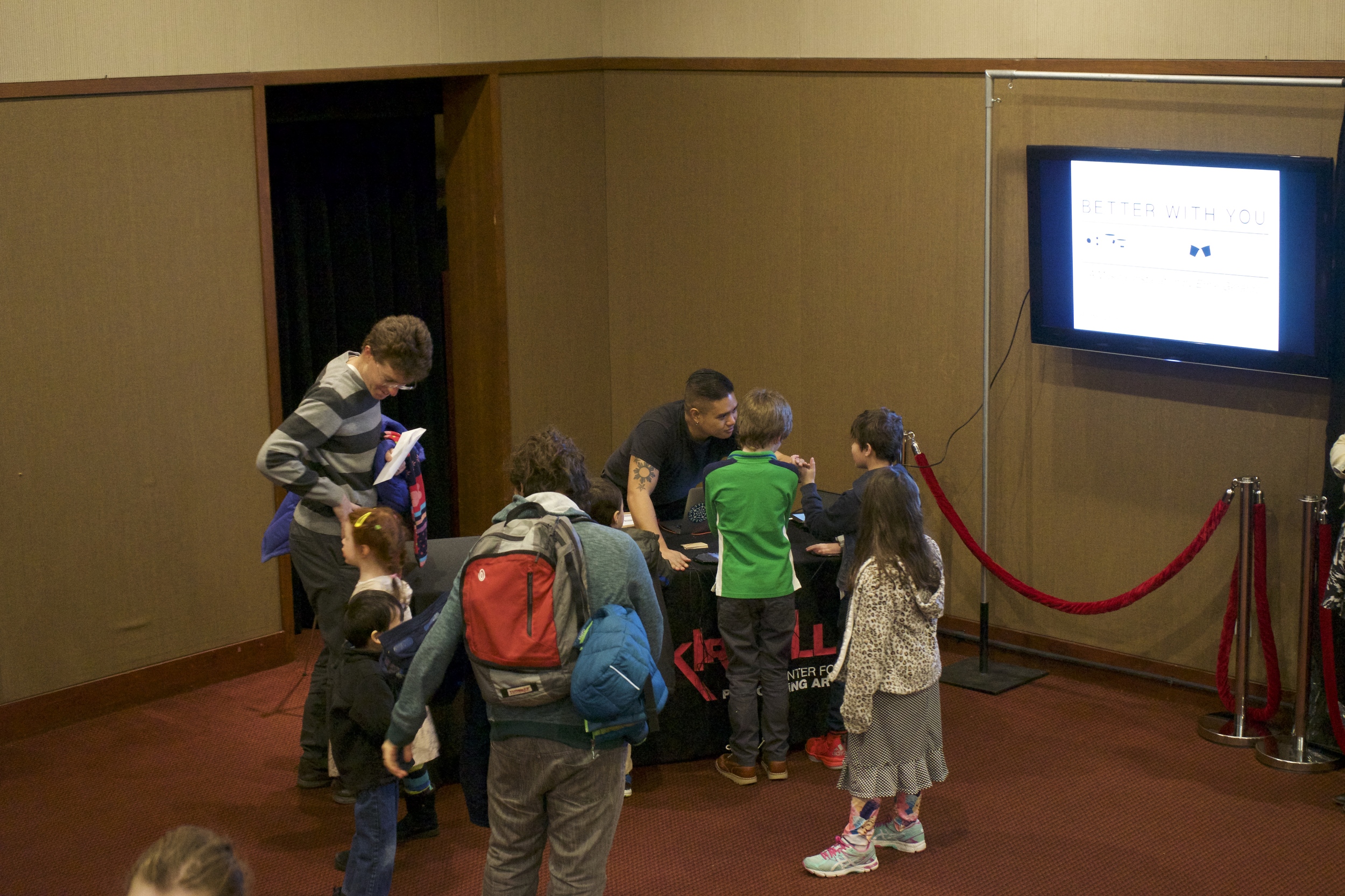
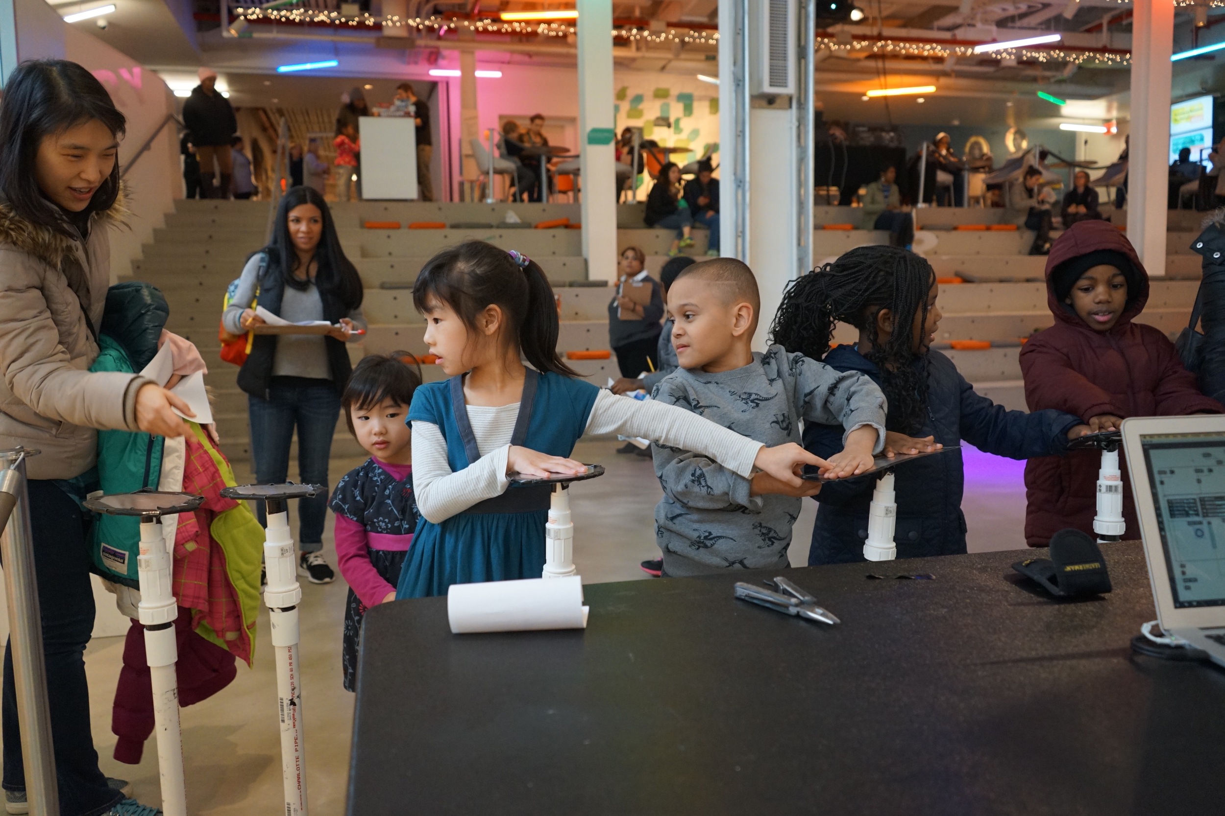
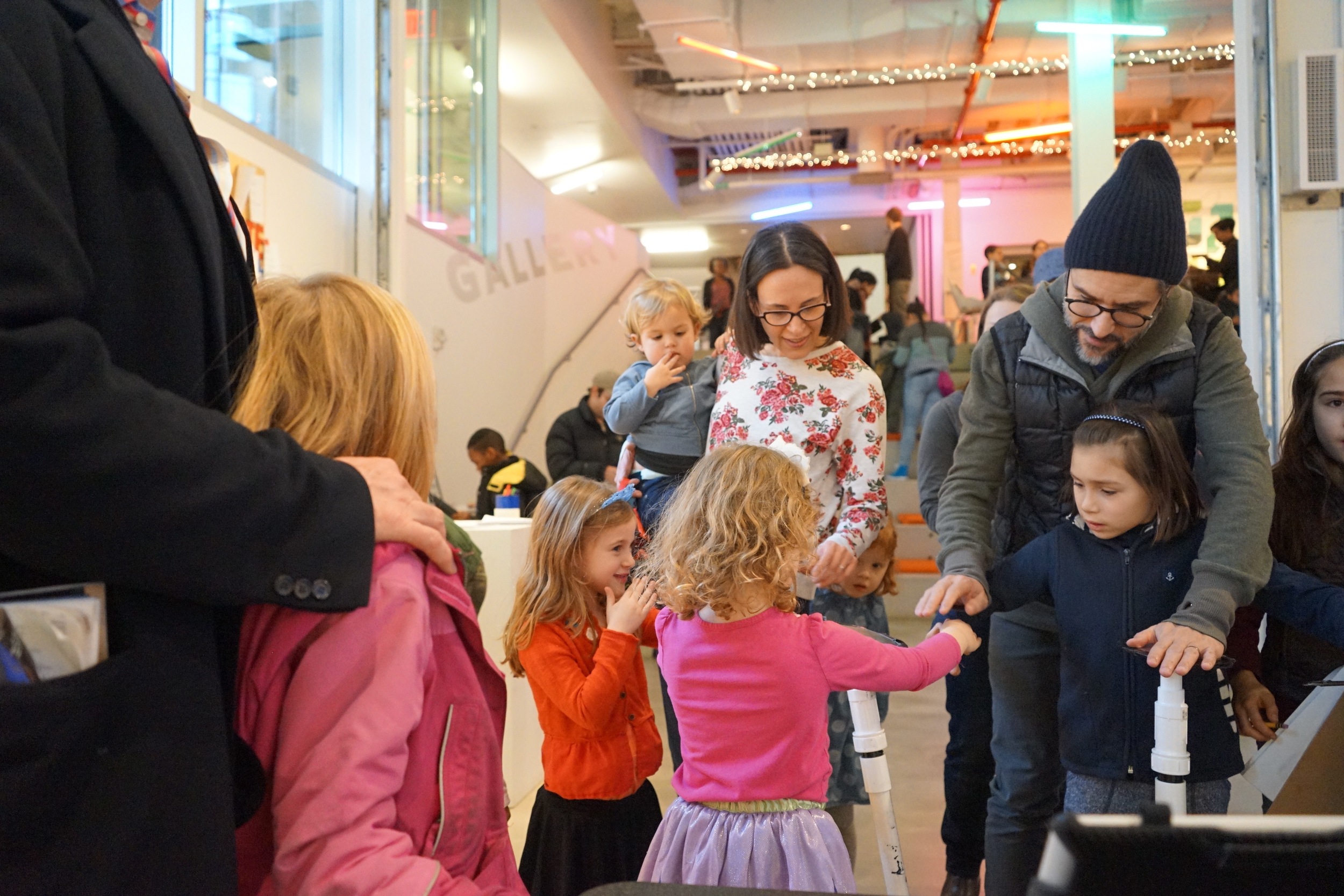
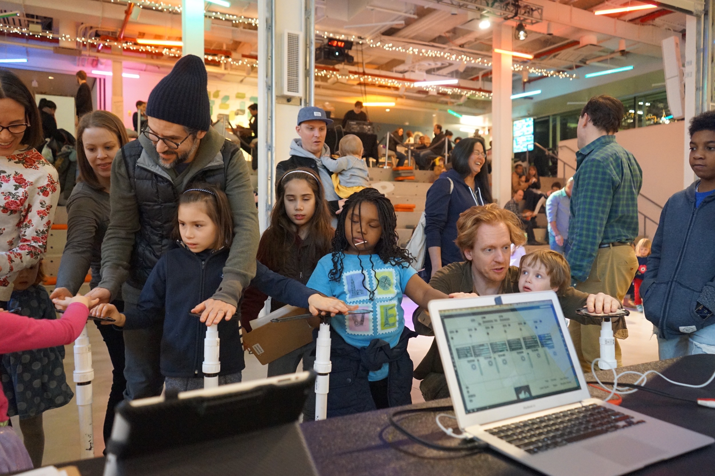
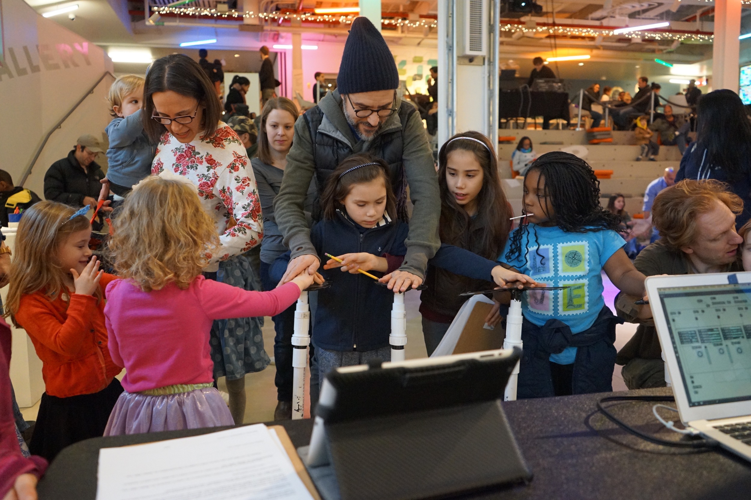
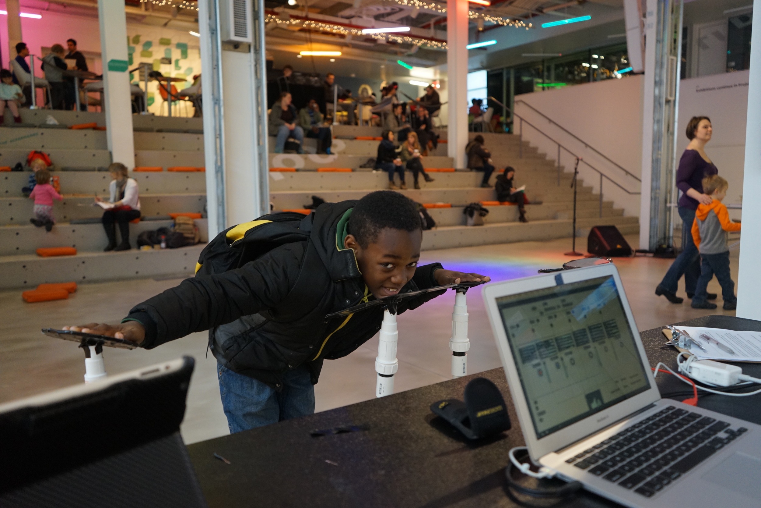
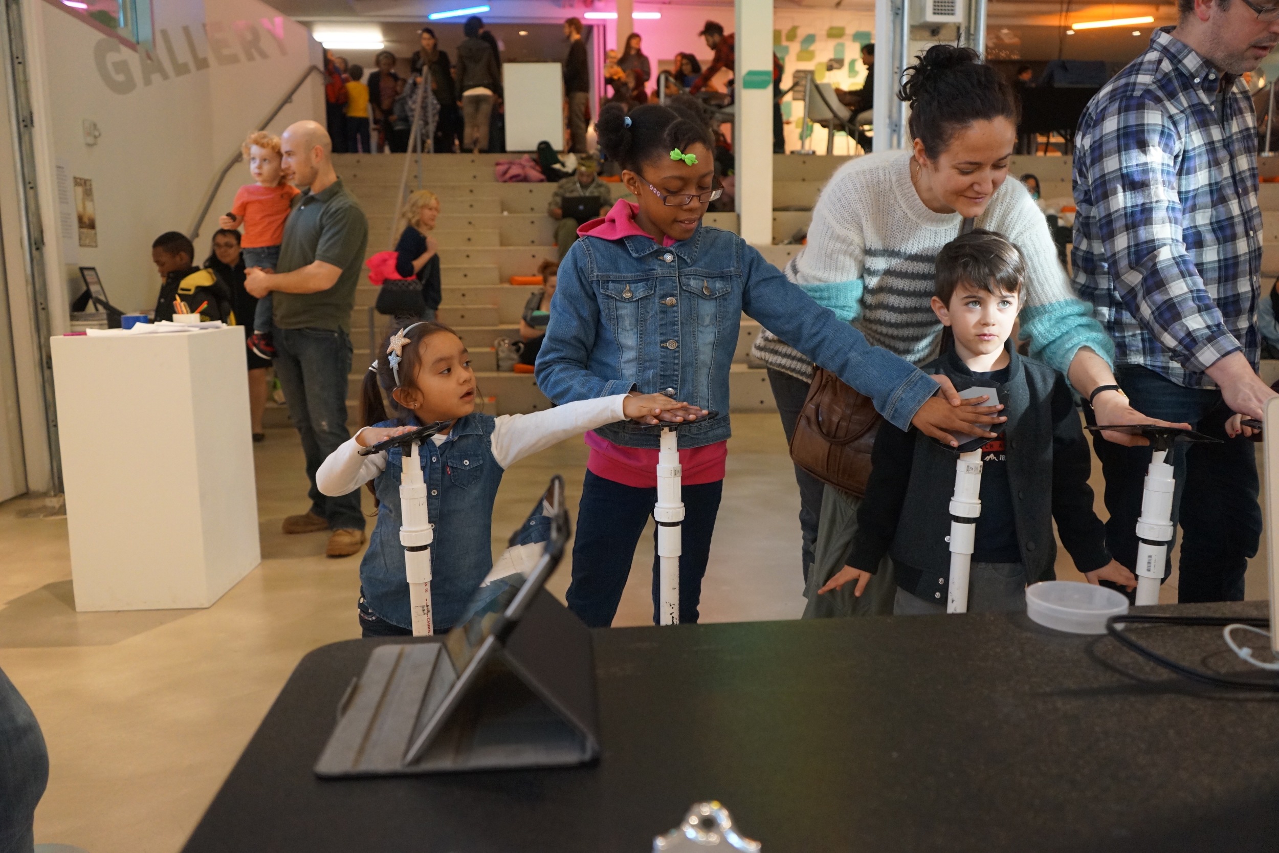
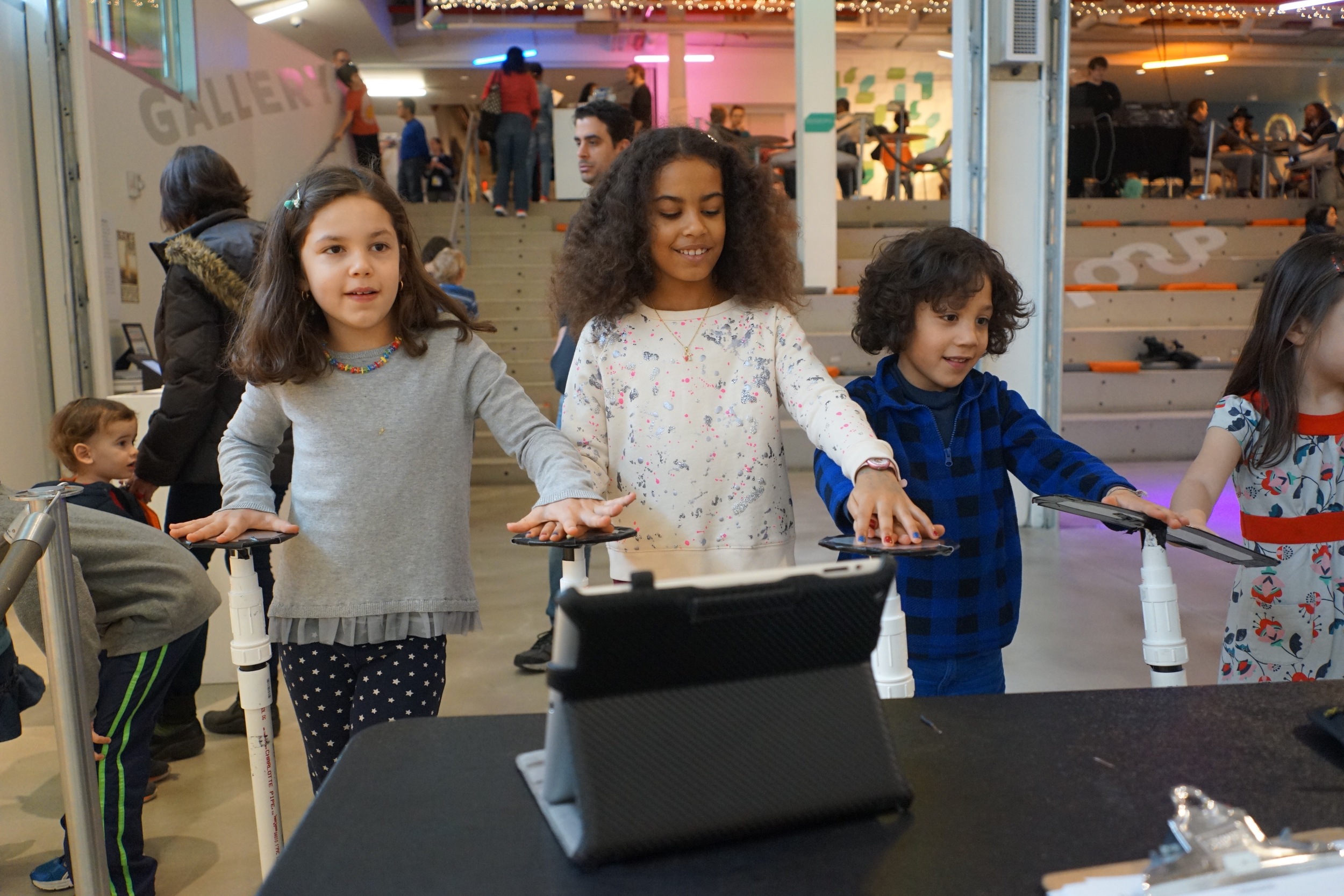
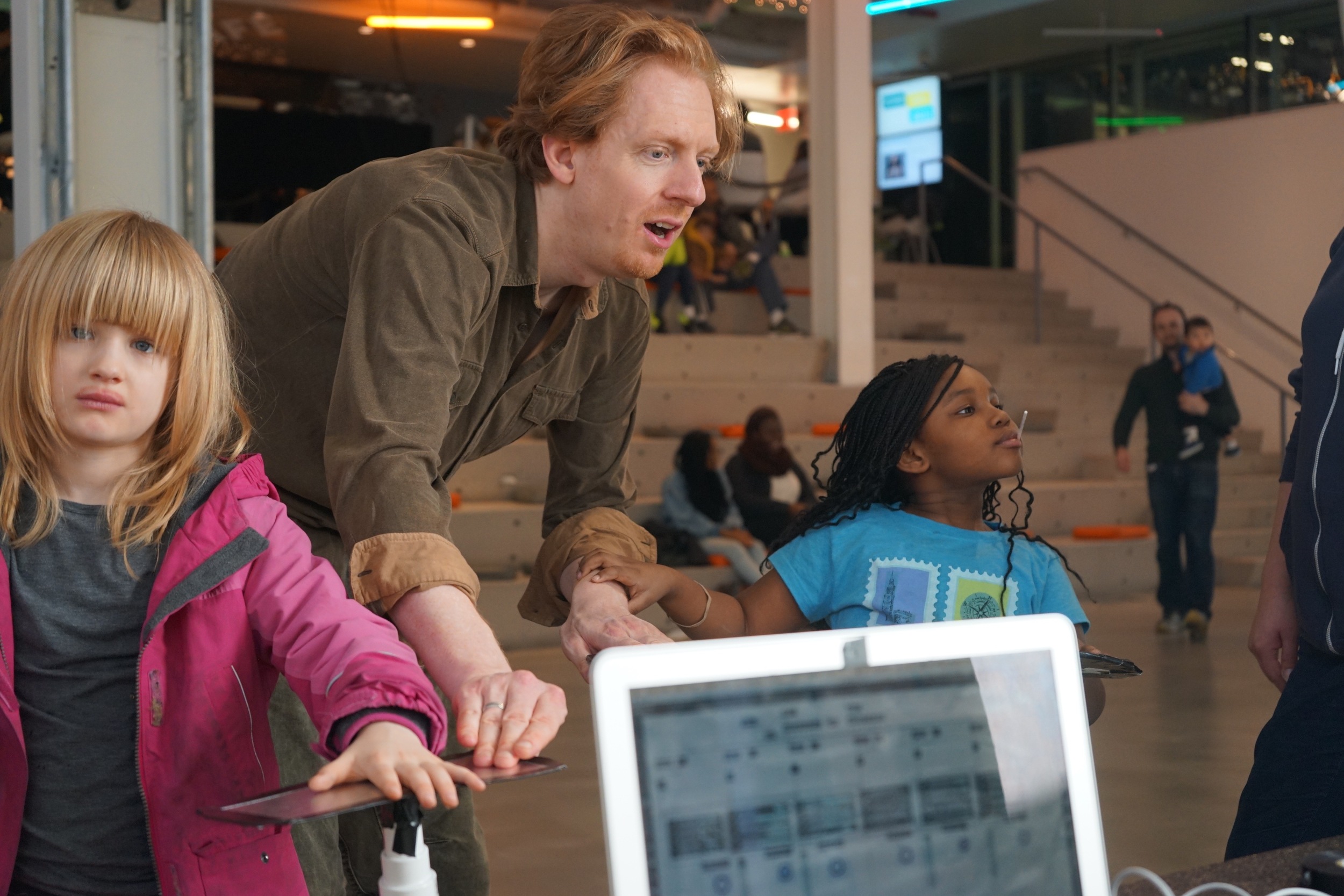
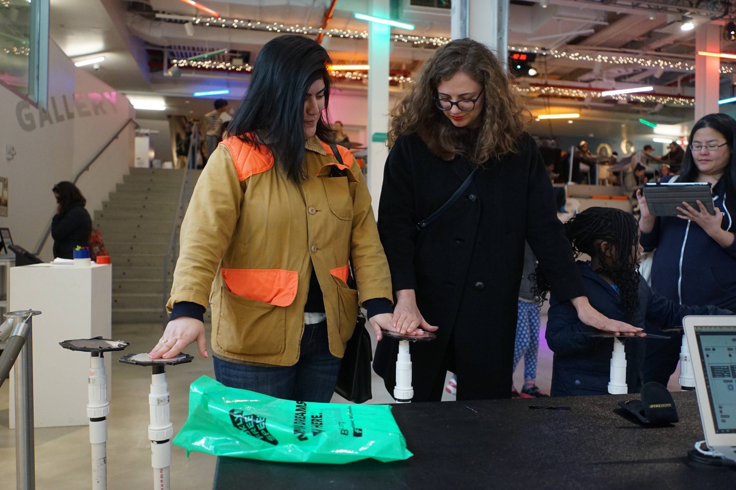
Here's what that fun yet chaotic hour looked like in pictures.

If you'd prefer, here it is in video form.

So that's it for March 5th. Stay tuned, Better With You will have more demos in the future. Hopefully in a way that lights. up.

Be good.

- Ernie

Better With You @ the BRIC Hack-A-Thon House Party by Ernie Gerardo

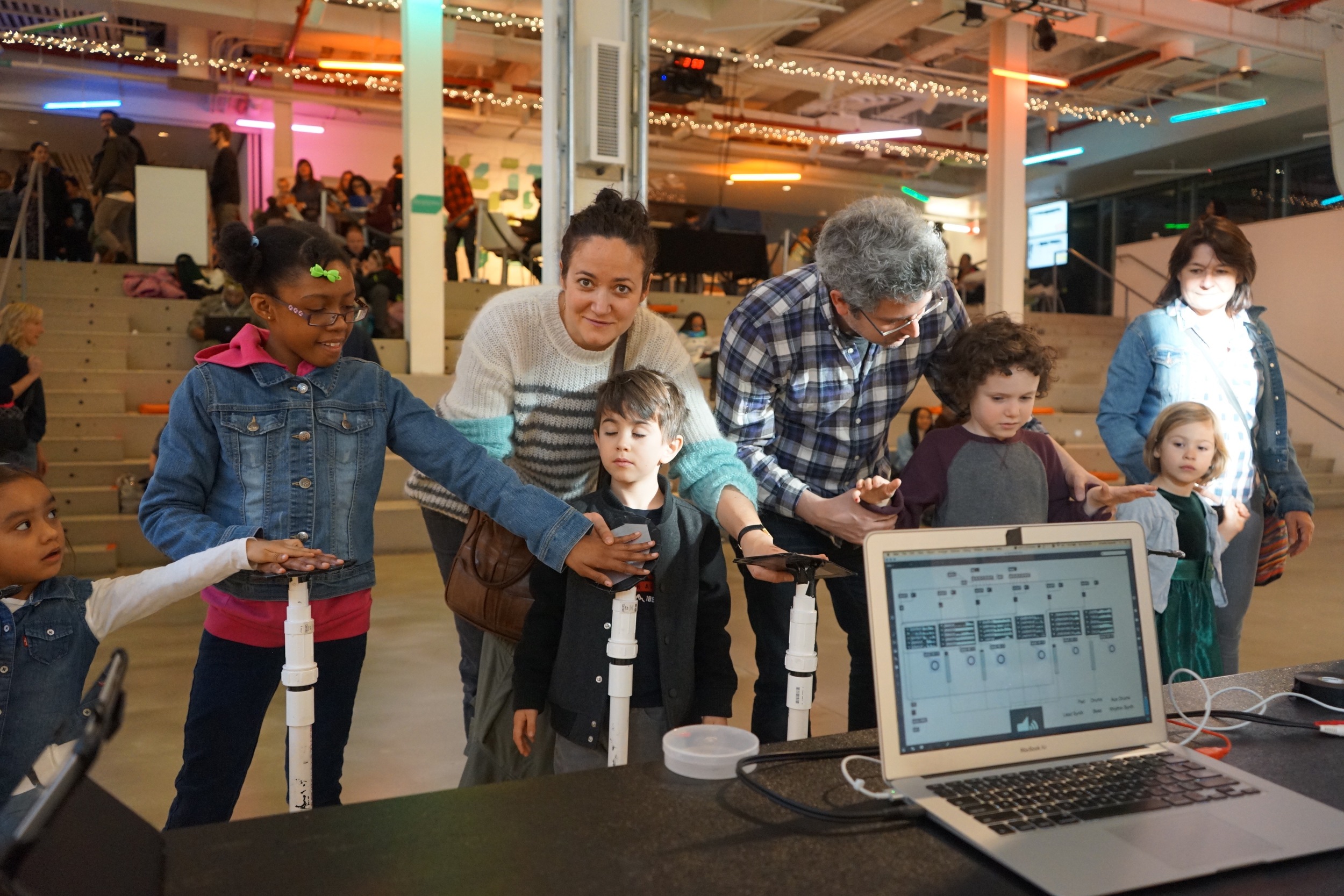
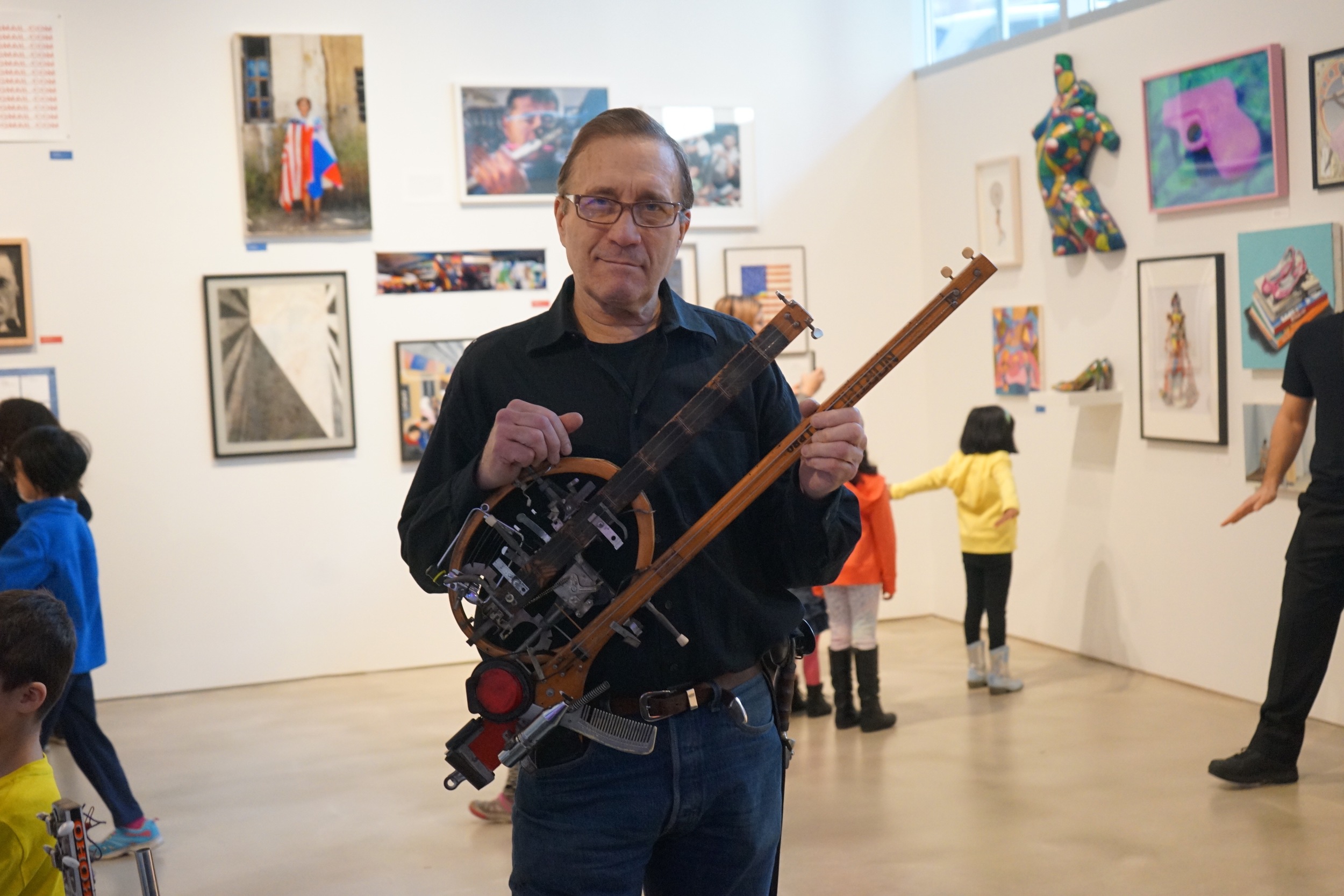
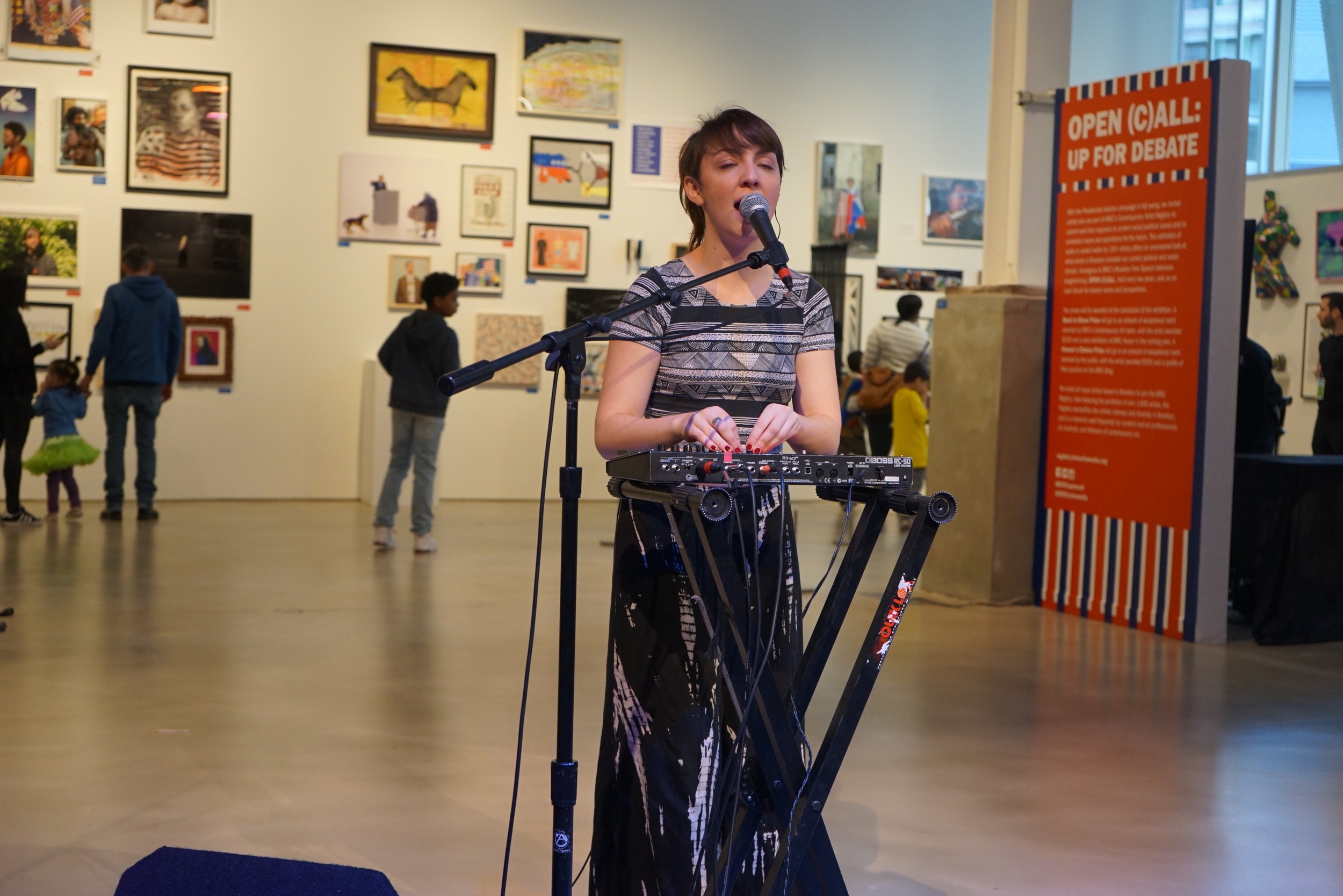
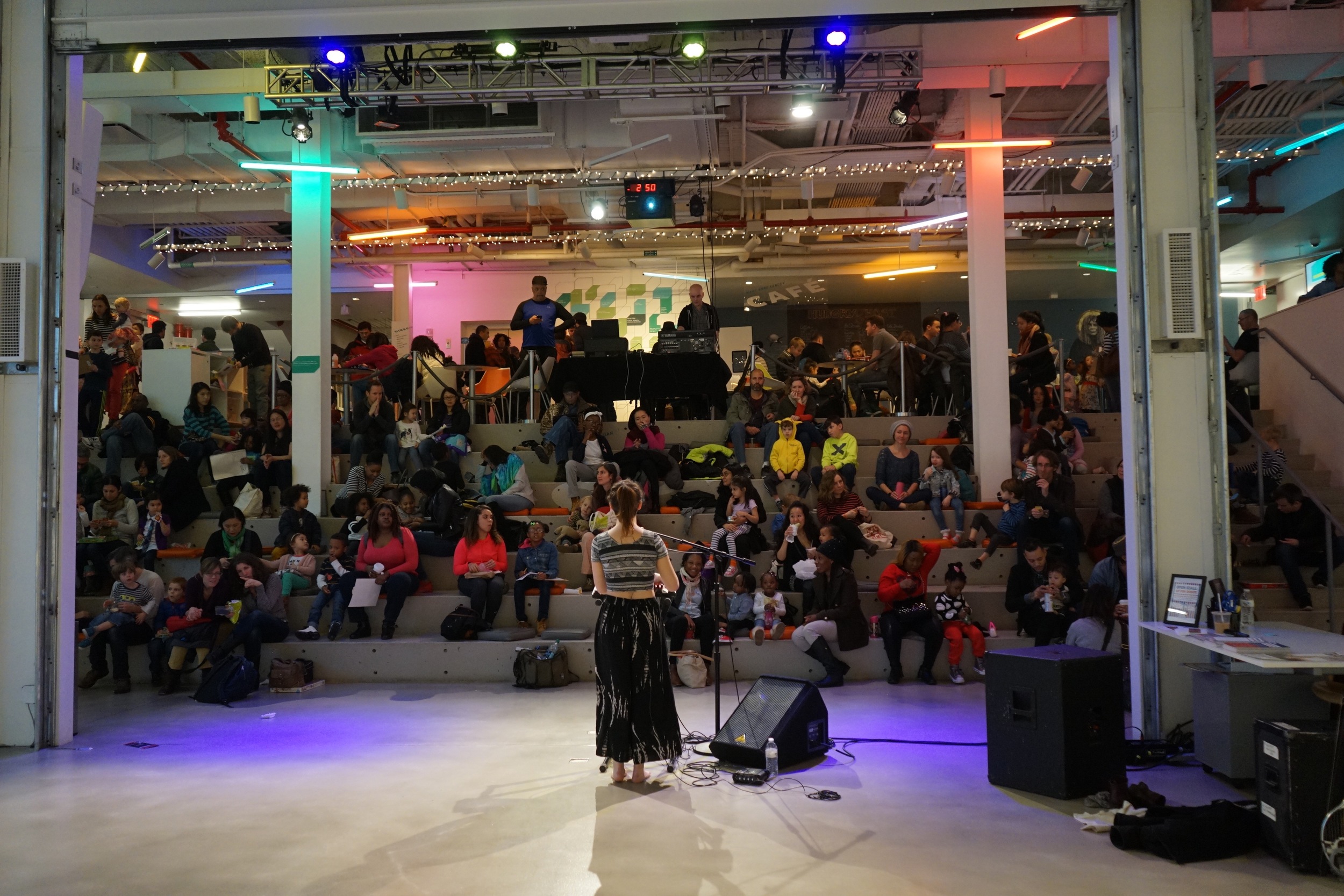
Last Saturday, I had the privilege of presenting Better With You in the wild for the first time. My hosts were BRIC in Brooklyn, who were having a family day party. The open demonstration occurred on either side of performances by the brilliant Ken Butler, as well as fellow Berklee alum Julia Easterlin, who is way too prolific and talented for me to share a stage with. But it happened! And it was awesome!

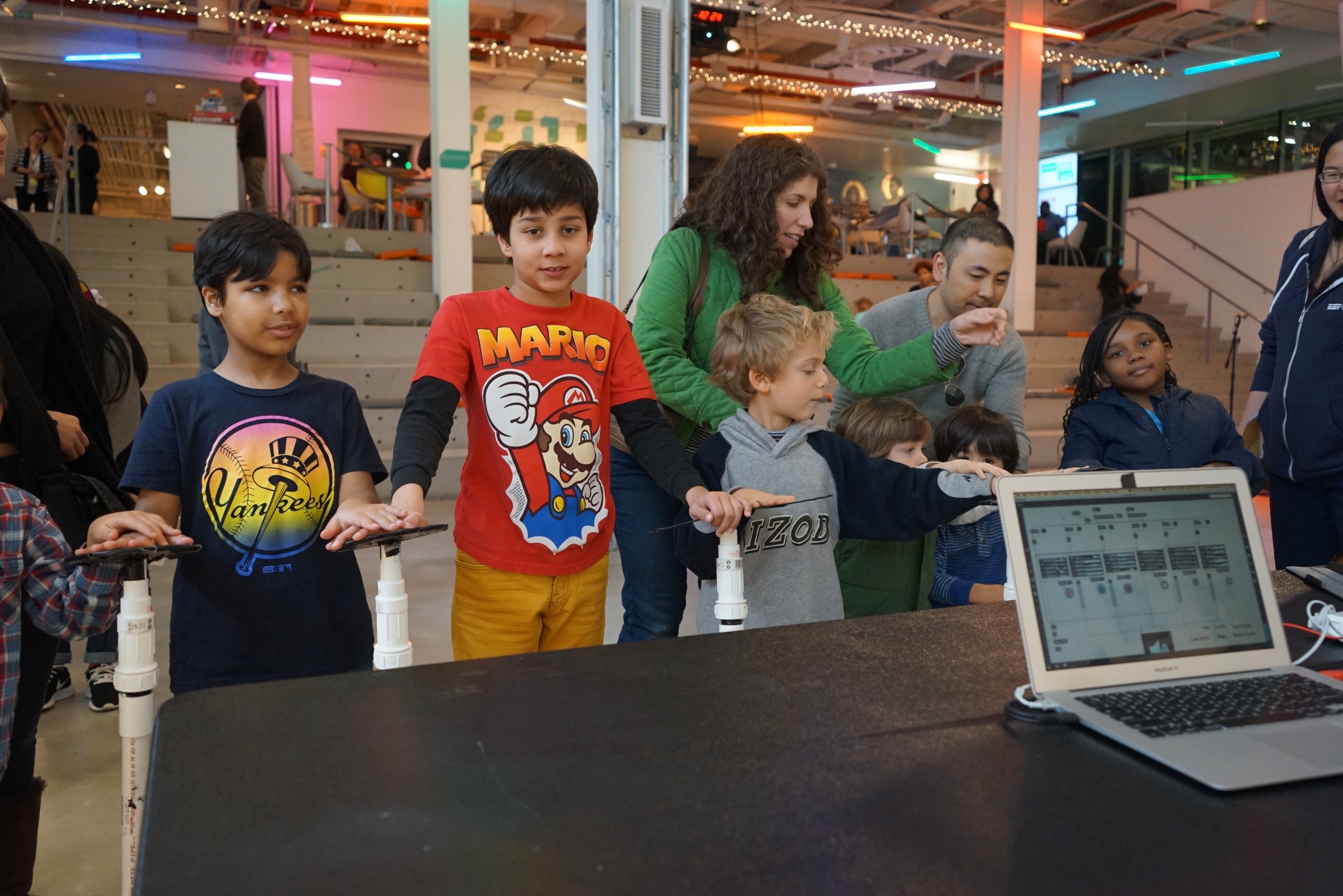
I used the opportunity to do a little research with both kids and parents in order to hone in the design a little more. However, since a picture is worth a thousand words, how about I just show you what happened? I mean, that's got to be like a million words then, right?

Actually, I was wrong...it turns out that video is worth even more words. So here's a minute-long version of what ended up being five hours of people using this thing:

So what did we learn? Mostly that parents love this thing. But also that in situations where there will be kids (and trust me, there will be kids), Better With You needs to be about a hundred times more durable and stable, since this prototype fell over and had to be re-taped several times throughout the afternoon. Luckily, it only took a minute, but I just have to be ready for the possibility that this thing will be handled roughly.
I also learned the value of investing in one of those big Purell pump bottles when a lot of people will be touching your installation art.

However, I have found some materials that will let me make a version of Better With You that can withstand a little abuse. And come March 5th, I'll be able to put it to the test. More on that later.

Be good.

- Ernie

...In Case You Missed It... by Ernie Gerardo

I know I said I'd post this a month ago, but life gets away from you rather quickly. Here is my thesis defense for Better With You.

I may be done with grad school, but just as quickly, there has been more on the horizon. Stay tuned!

La Defense by Ernie Gerardo

Okay, so sorry for not blogging here over the course of the week, but I've been busy crafting THE THESIS DEFENSE. Also, that was yesterday's date, so I already did it. And passed.

But there's still more to do! The paper (linked later, since Google Docs formatting seems to be at odds with how the university requests) needs to be corrected. If you missed the presentation, fear not, it will be online in video form later this week.

Is there a German word for "you did the hard part, but you still have other stuff to do?"

First Advisor Meeting by Ernie Gerardo

We are both the stoic type, if you can't tell.

We are both the stoic type, if you can't tell.

Next to my lovely mug is NYU adjunct professor Ethan Hein.  We first met at an Arts Media Maker Hack earlier this year, and after some back-and-forth about our mutual interests in music technology, I asked him to be my thesis advisor, and he said yes.  I'm actually his first thesis student to ask him to do this, so I think we'll both learn something.

This is the documentation of our meeting on Friday.

He did come at me with the caveat that he is by no means an expert in the ways of the specific technical aspects of my project, but the area where he offered his help is the one where I'd need it most of all: understanding what I don't already understand.  For instance, I wasn't even sure where to begin with comparative analysis, until he asked me for examples of pieces that inspired mine.  Once we got into that, the floodgates opened up, and what I initially thought would only be a twenty-minute catch-up turned out to be one of the most production 90 minutes I've had.

He actually encouraged me to answer some questions.  To boil down his more more salient points...

- Make a list of public sound installations that are similar to what I'm trying to do.  An example of a few can be found in this Pinterest board I created last semester.


- What is the intended purpose of a given piece?

- Figure out why they do or don't work for their intended purpose.

- Where are they located, and does that factor into the function or success of the piece?

- If we are to say the audience is "members of the general public," then what subset of them would choose to interact with a piece of art, and how long would they spend doing so?

Those are just the abstracts.  We also discussed practical aspects of the piece, including whether or not the piece can provide haptic feedback to a user, how the piece should indicate that it is working, if the feedback from an interaction isn't immediate, and possible materials.  He also recommended some literature for my research.

So far, I've come away from this first meeting armed with a few good questions to research, and some very big practical considerations to approach with just a few months to complete a working model.  Daunting, yes, but I have a great team on my side.

Thesis Milestones, week 2 by Ernie Gerardo

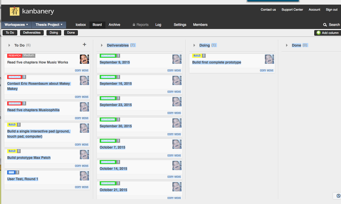
As suggested by our instructor, I created a few systems to stay on top of productivity.  In addition to the iCal, which syncs to my phone to give me reminders of due dates, I also set up a project milestones Kanbanery board.  While not entirely complete, it allows me to assess different areas where I need to focus.

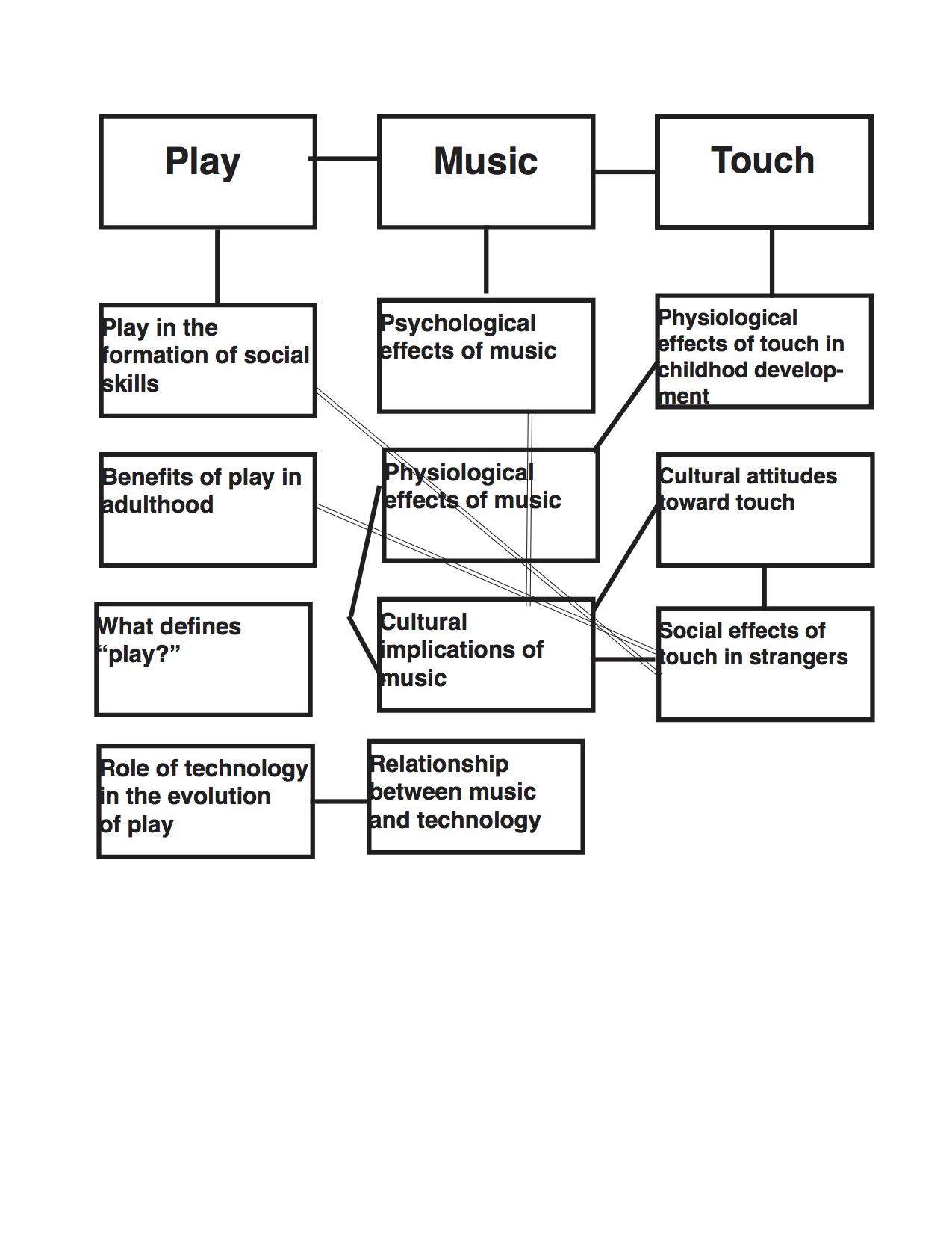
In order to better express the two main components of my project, Better With You, I created a mind map.

Admittedly, the concepts here are rather general, since my line of thinking on this is mostly of the tangible, practical nature.  Treating my project like a body, I have to pay attention to both the physical and mental (software) development, so that it functions like I intend to.

However, this line of thinking doesn't account for the cultural context of my project.  There are a lot of intangibles that I would need to be able to explain.  Therefore, in addition to the general project map, I also created a map for the defense paper, just so I could get the main ideas out there.  I figure this will also help me draft an outline in week or so.

A lot of these ideas aren't complete, and some aren't quite clearly connected to more than one other at the moment, but I want this to evolve as I compile more research.

On the software side, my initial prototype for the software was mocked up in Scratch, just to roughly test the functionality of the physical components.  Those who shared the pre-thesis class with me last semester may have seen an earlier version of this, but the latest can be found here.  Even though it works with keyboard commands, it works great with the Makey Makey.

Of course, this is in place of the actual software that will eventually drive the guts of the installation, so be on the lookout for my first generative software Max patch by the end of the month, which, admittedly, will most likely be a random generator instead of the deterministic one I will build by the end of the semester.

On a final note, as far as less-deliverable progress goes, I was able to connect with my advisor before traveling over the holiday weekend (Cleveland gets awfully muggy, let me tell you) and arrange for at least twice-monthly meetings at the Washington Square campus.  I am also working with Alex Ruthmann of the MusED Lab, as I am having him put me in touch with the creator of the Makey Makey, which will hopefully lead to some insight on how to safely power a large-scale human conductive circuit.

I can't believe it's already Wednesday.

Welcome To The Circus by Ernie Gerardo

First off, congratulations to the New England Patriots, who proved that being evasive about whether or not you tampered with sports equipment can only lead to good things.  That’s right kids, I bypassed the month of January, having survived both the Snowpocalypse, and the Lego Movie getting snubbed for an Oscar.  If you’re looking for what’s I’ve been up to between the last post and this one, here’s a hint…

That’s right, among other things, I finally got Soul Search Records up and running again in our new home, just five minutes from the old one.  That means my Midtown Manhattan peeps are still going to have to take Route 46 out to Parsippany-Troy Hills, but I assure, you, our proximity to the best sandwiches in the Tri-State Area makes it worth it.

In other news, my homies at the MAGNET just put in a badass new motion capture system, and (with a little help from yours truly) finally have their recording studio up and running.  And now I’m probably going to continue to use this blog as a platform for displaying all my Ideation and Prototyping projects.  You’ll also notice a new tag to the navigation up top.

It’s there because I’m in PRE-THESIS!  Man, I can already feel the sleep deprivation!  Anyway, this is going to be a hell of a journey, so if you want to see where I’m at with it, I’ll be constantly updating it.

That’s all for now, be good kids.

Project 4: I'm lazy, so I'm copying the booklet. by Ernie Gerardo

So just to give you a little background, project 4 was to be my own creative project.  I settled on a web platform similar to Sprout Social, but more geared toward content creation, with an emphasis on large-format content (mostly of the music/video variety).

I had to create a project booklet to present to my teacher, so everything you read below the logo will just be copy taken from that.

Without further ado, take it away, me…

The Basic Idea

Do you manage several social media accounts for your business or brand?  Or maybe you’re a content creator (video, audio, etc.).  Managing a lot of accounts plus content uploads can get tedious, especially if constant fan interaction is important to you.  Just as important are the analytics, measurements of how effective your audience outreach and content releases are.  But what if you could manage and schedule posts and content releases over multiple social media platforms, as well as track the effectiveness of this content using one tool?  Enter Rockbase.

User Research

The very first form of research I did was not the best one, but it helped me understand my own goals a little more.  I talked to the manager of a local rock band.  She explained that since she’s the principle poster for at least three bands, it’s difficult for her keep track of every network she has to cover when talking about shows or new albums.  She probably represented my target audience.

I also talked to a bunch of friends in bands, some of whom had managers and others serving as their own managers.  When I brought this idea to them, the concept was one of intrigue.  Maybe I had tapped a market.

The next step was to build a survey.  Once I had this, I distributed it amongst my friends, as well as my UX classmates at NYU Poly.  This led to a very diverse set of people, not all of whom were musicians or managers (in fact, a little less than half).

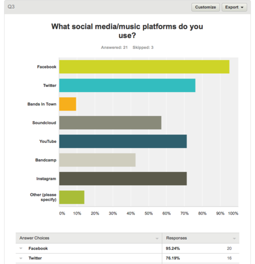
In the end, I had 24 responses.  Some of the more interesting points of information from the survey…

  • 95% of respondents regularly use Facebook, although it was not specified if that was for personal or band use.
  • Instagram and YouTube were tied for most popular content distribution platforms (each coming in at 71% of users), while a little over half used Soundcloud.  As the use of platforms is not mutually exclusive, I’d assume there’s a bit of overlap, especially with those who create content.
  • Of the non-musicians who answered the survey, I got a few theater and film people, making all types of performers a good target market for this app.
  • The most popular way to spell “Rock” in a music context is Röck.  Meanwhile, in a wrestling match between Lemmy and God…actually, trick question, Lemmy IS God.

Paper Prototypes and First-round User Testing

While compiling the results of my user survey, I also decided to sketch out a few different pages of what I hoped the app would look like.  Since I hadn’t drawn out every single clickable possibility on the homepage, I had to explain to the handful of testers what each function did.

Probably the single most important omission I had to correct was the absence of a sign-in feature, as well as the lack of analytics and account management, all features that would arrive in the interactive wireframe.

Iteration 2

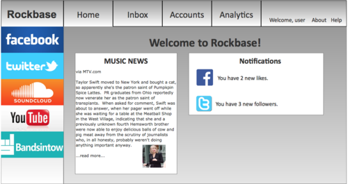
I moved over to Axure to build out my prototype for Rockbase. 


That’s the main sign-in page.

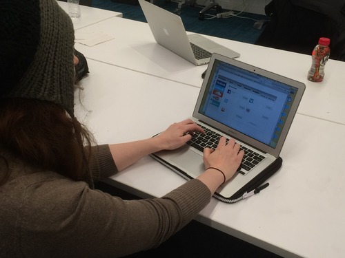
After several lunch breaks at work spent hunkering down over the laptop, I got to a place where I was comfortable testing it out.  So I mailed it out to a few friends, got some of my classmates and coworkers, and eked out a decent sample of users (all-in-all, 10), not just musicians, but different kinds of performers who could use Rockbase to manage their media.

User Testing, round 2

As stated above, I started out user testing with my musician friends.  However, when I couldn’t get enough responses, I turned to my classmates at NYU Polytechnic.  Luckily, the cool thing about the Integrated Digital Media program is that several of the students are also performers, putting them right into my target audience.  Here were my findings after round 2:

  • Initially, I was linking directly to a “create new post” page for each network, instead of a dashboard with all of their statistics.  My co-worker, Mik, pointed this out, and my response was to mock one up, that links to the analytics and scheduled posts.
  • My classmate, Lauren, pointed to several superfluous buttons, many of which were redundant and confusing.  Those were removed in favor of one-step selection.
  • Several expressed desire for support from platforms not included in the prototype, like Vimeo.  Additionally, as one of the testers was a photographer, he wanted something that could post to his Tumblr.  I’ll have to see if the API can support an app like Rockbase.
  • Believe it or not, I did not include a sign-in function in the first iteration.  The function now serves as a gateway to the other interactions in the prototype.
  • Among my musician and management friends, the general consensus was that the app could be useful, once a few more functions were made obvious, like viewing fan numbers and growth (now a function of analytics), as well as being able to manage songs and videos from the app once they’ve already been posted (this includes functions like monetizing YouTube or tracking ticket sales via Bands In Town).

For the clickable prototype, check out…

http://4052jl.axshare.com/home.html

Otherwise, the next thing you’ll see is my portfolio.

What a semester, guys.  See you on the other end.

Project 3, part 3: You know what? Just take the booklet. by Ernie Gerardo

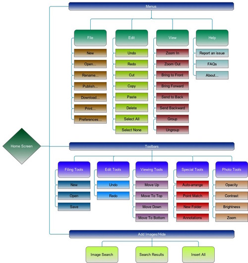
And here, dear reader, is the fruit of our labor.

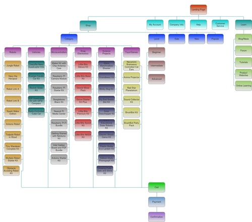
No, just kidding, that’s the sitemap.  Pretty colors though, right?

My good friend and project partner, Dan Clarke, has provided the overall link to the booklet.  Firefox users, be warned, this may not work properly.  Try Safari, Internet Explorer, or Chrome if it’s giving you trouble.

Please do the clickings!

https://lifeofdclarke.files.wordpress.com/2014/11/magnetic_frickprojectbooklet.pdf

- Ernie

Project 3, part 2: I'm a user baby, so why don't you kill me? by Ernie Gerardo

Moving onto our user tests, well, here’s some pictures of that.

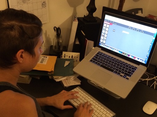
One of the first users I tested was Fallon, a programmer.

At first, she was having some difficulty with buttons not showing up.  This was good to know, as it gave us some sort of idea that the window size can affect the visibility of some functions.

My fiancée Cassandra (a graphic designer) was actually the first person I tested, which goes back to an original iteration, when I showed her two prototypes based on both designs.  I brought her back into the fold when we were more heavily testing the design we ultimately went with.

Her feedback had more to do with the fact that certain buttons that looked clickable were not, even the ones that were meant to be (in this case, check boxes for image selection).

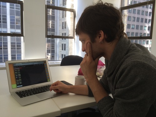
Scott (a General Assembly student) and Mik (an operations manager for Launch LM), below, had feedback relating to the absence of a crop tool, as well as the low visibility of metadata.

In addition to these users, the Dans ran user tests on their live-in SOs, and Donovan attended a few NYU events, in order to get some tests done with a student as well as professor in the museum studies department, who are very close to our target market for this.

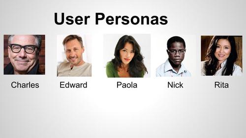
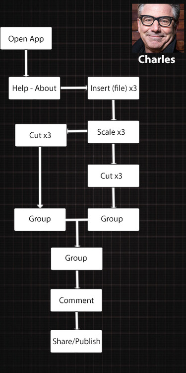
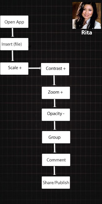
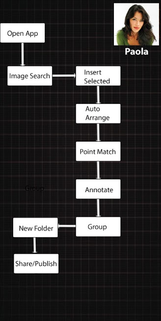
The user research, combined with our goals, yielded five distinct personas:

Each one in a different age group and professional background (details can be provided upon request).  Once we had those down, we had to form a user flow for three of them, based on the functions of the tool (At this point, we were on something like iteration 4).

Once these were developed, we had the tools in place to start our presentation, which is a whole other ditty.

Project 3, part 1: Oh dear... by Ernie Gerardo

Well, faithful reader (I’m assuming that this is just Dana reading this), I owe you an apology for not keeping you posted on the third project, but it happened to fall on the midterm season, and ho-lee-crap was it busy.  Let’s just jump into it.

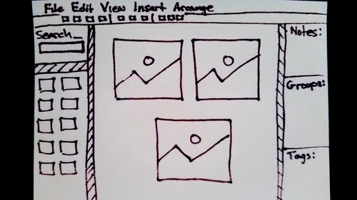
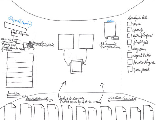
Our task was to create a tool for the curatorial team at the Frick Collection to use to catalog their unsorted inventory of over 10,000 images.  Originally, they said they wanted something like “Pinterest in a lightbox,” but it became apparent that they weren’t quite articulating what they wanted.

Before I get too heavy into it, by the way, meet the team:

image

Here’s one of the Dans, who mainly worked on interactions.

image

Here’s the other Dan (you remember him from the last project), who designed one of the prototypes, and also worked on the interactions for our final prototype.

image

Here’s Donovan, who took the lead on user research and testing, but also designed one of our prototypes.

image

…and then there’s me, project manager, copywriter, and presentation/booklet builder.

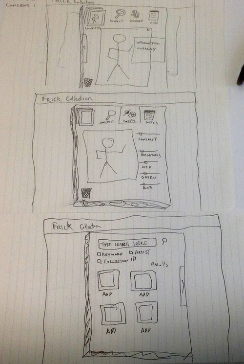
Once we got down to establishing the goals of this tool, day 2 involved sketching out our ideas.

image

Here’s Dan M’s Photoshop-based prototype.

image

Donovan’s, which is based on the Animus from Assassin’s Creed.

image

And mine, which was lightbox-based, but had the functions of a mini-Photoshop.

Let’s keep this one short, next time, we go to user testing and forming personas.

Project #2, part 3: DELVIERABLES US FROM EVIL by Ernie Gerardo

So as stated before, here are the deliverables for our project.

Sitemap:

image

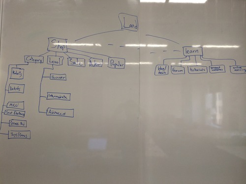
…user flows, presented nice and clean…

image

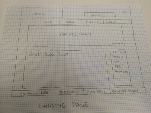
…and wireframes for Bev’s interaction.

image

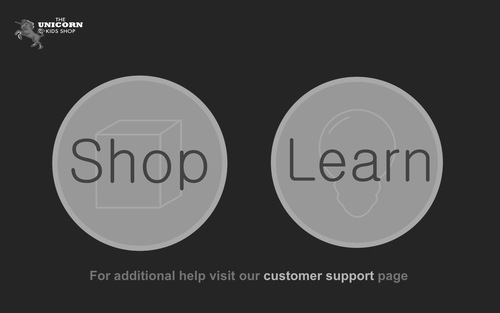
Initial landing spot.

image

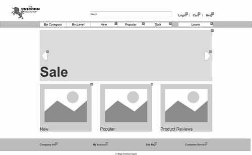
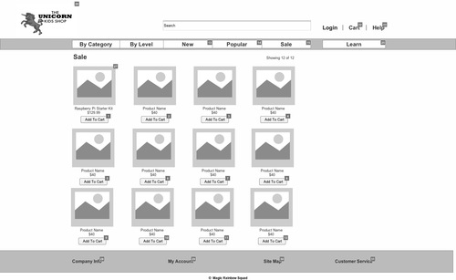
Main shop page.

image

Items on sale.

image

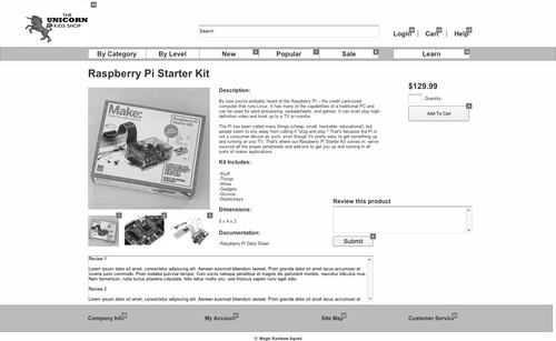
Product page.

image

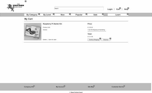
Cart.

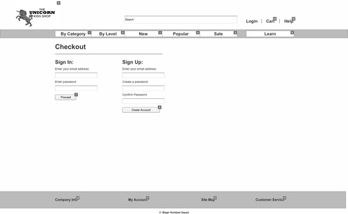
imageCheckout.

image

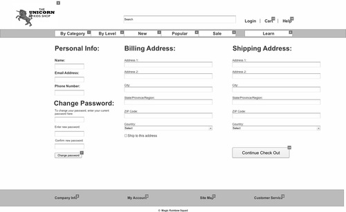
Account creation (Bev’s new here, you guys).

image

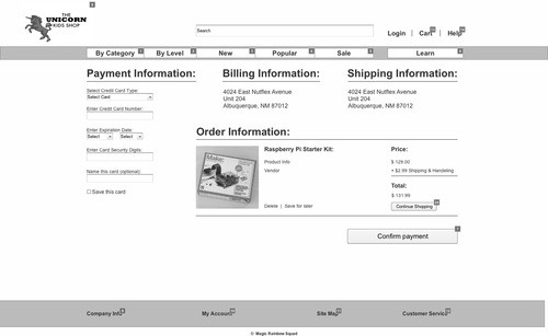
Payment information.

image

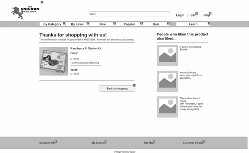
…and at the end of our interaction, a nice confirmation page that will take you back home.

The brave among you can interact with our prototype that not only has the interactive requirement for one user flow, but also includes some pages for the “Learn” section, and the information Linea wanted for customer service.

Interaction can be found at: http://saamuo.axshare.com

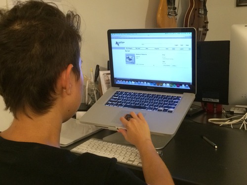
Like last night, here’s my girlfriend Cassandra working through the prototype:

image

Her notes:

Working as Bev, it’s pretty easy to navigate or figure out, not terribly different from any other online store.

The login button works kind of weird, doesn’t react to typing (Ernie’s note, a consequence of compressed time on working through the prototype).

I can’t leave a comment (Ernie’s note: ditto).

My boss at LaunchLM, Mikhail, also play-tested the site this morning, and had this much to say:

image

I’d like to be able to click on everything.

(upon hearing about the persona for whom the interaction was made) I don’t know, if I were a grandma, I don’t think I’d really care about looking cool.

I’d like to be able to scroll in the review screen without having to click on it first.

What’s going on with this login tab? (the interaction isn’t active on all headers for the prototype.

Finally, even though we are technically competing for the group that “kills it” (I think Dana Karwas has the trademark on that term), our classmate Sryia rounded out our focus group.

image

To this end, she really embraced being Bev, and had this to say:

-Would have liked to see the recommendations earlier and not just at the end of the confirmation

-Its good that you can add to cart without having to look at the product info page.

-As a 73 year old woman this site would have worked well for me.

The significant others of Dan (Erica) and Brigid (Brian) also tested the prototype, and quite a few suggestions, mostly aesthetic, made it into the iteration you see before you.

So I suppose this raises the question: Does this do what it’s supposed to?  The answer is yes, you can go here and buy things, and sort them by categories built through association (I think I may have spent too much time reading the Media Studies homework). 

“The show doesn’t go on because it’s ready; it goes on because it’s 11:30.”

- Tina Fey

It’s pretty easy for a first-time user to figure out how to buy something deemed cool or sale-worthy, and honestly, though I may have tweaked the aesthetics with more time, from a functionality standpoint, I’d say we’re in a good spot, and given the time constraints, that’s all I can really ask for.

The Magic Rainbow Squad (the original names were much worse) has run its course, and although I really liked working with these two, it looks like we’re breaking up the band.  See you at project 3!

Project #2, part 2: Dammit, it's supposed to be Sunday! by Ernie Gerardo

So here’s the team living out Loverboy’s greatest hit:

image

Most of today was just banging out wireframes and the sitemap, tweaking our prototype, and working on our presentation.  While most of that stuff is top secret until we present on Monday, here’s a little sneak preview of the sitemap:

image

…and some of my own talking points for Monday as well.

image

Finally, as a small bonus, here’s my girlfriend testing our prototype:

image

My guess is it will be really easy for Bev to buy some toys for her grandkid tomorrow.

Deliverables will follow in the morning, but if you’re reading this right after I post it, get some sleep.

Project #2, part 1: Let This Unicorn Sell Your Child Products by Ernie Gerardo

Hoo boy, are you ready for a lot of pictures?

To start, my partners in crime on this venture are the always-awesome Brigid Walsh and Dan Meretzky.

The assignment is to make an e-commerce site for these wonderful unicorn lovers.

image

Mythical creatures make great toy store mascots.  We were given a list of forty-eight STEM-based toys/maker kits, as well as three personas who each had a unique goal when browsing this site.

What’s the first thing I did?  I had lunch.  The second thing was to meet with these cats right away, and draw out our sitemap and wireframe concepts.

image

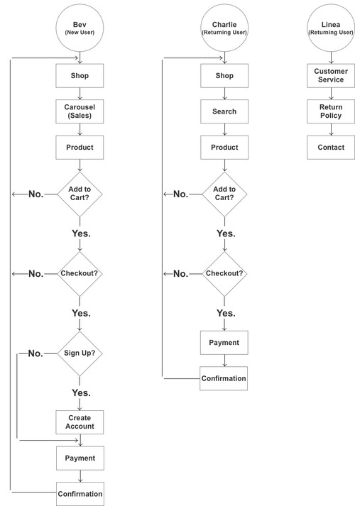
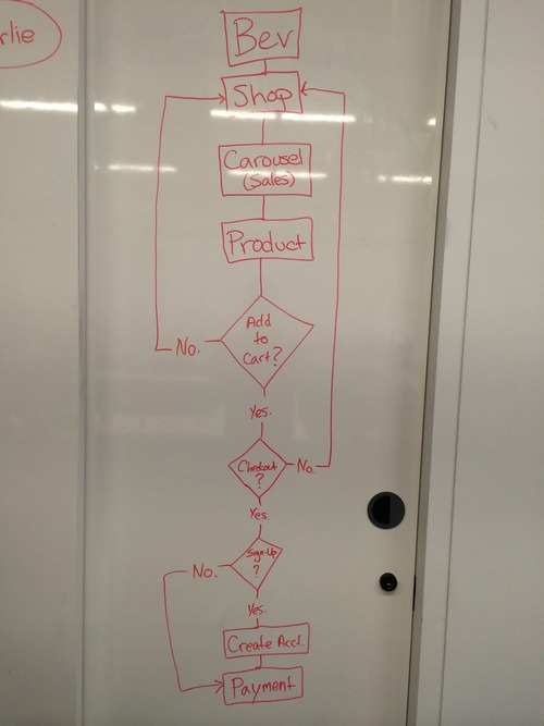
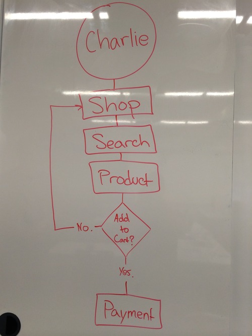
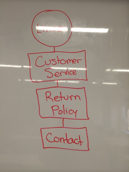
imageSee what I mean about all the pictures?  We also had to set up an hierarchy of needs for each of our personas, Bev (a grandma who wants to seem cool), Charlie (an software millionaire with nieces and nephews), and Linea (a 30-something mom who just wants to know the return policy).
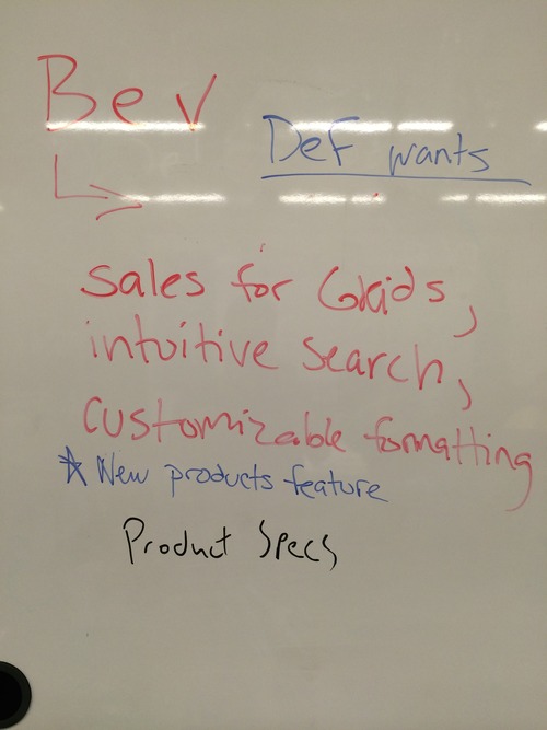
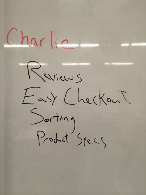
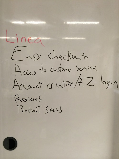
From there, we were able to determine user flows for each persona.

image

Bev’s user flow

imageCharlie’s user flow

Linea’s user flow

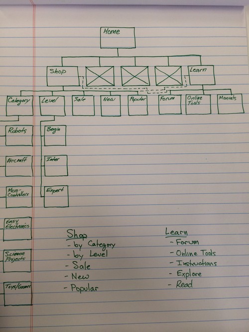
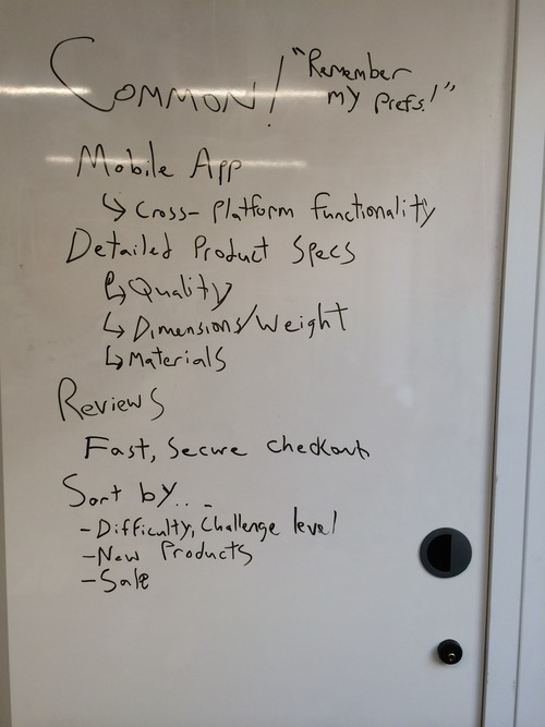
In addition to these flows, we also categorized the products, which allowed us to determine how we would sort in the shop section.

…and here’s where we ended up.

Coming up in part 2, we work out a more formal sitemap and a few wireframes.

It’s coming quite soon, promise.

Project #1 Deliverables by Ernie Gerardo

If you saw the last two entries, you are probably up to speed on the process, as well as the problem being solved, including seeing what the paper prototypes looked like.  Having said that, here’s a breakdown in the form specified in the assignment:

PROBLEM: Neill wants to know where on the New York City Subway he can access WiFi, especially for his commute to school.

SOLUTION: An app with a database that has wireless access on every stop in the MTA.

PROCESS: After a phase of research, which included both going online to determine which stations were officially outfitted with WiFi, as well as physically visiting several subway stations to determine if they receive a cellular signal, based on cellular data standards (LTE, 3G).

Subsequently, the paper prototype was designed to provide a straightforward list of lines, stations, and station information, so that within two intuitive steps, the user is able to find WiFi along their route, if it is available.  By following a simple third step, the user can access more detailed information about any station in question.

ITERATIONS: Neill was able to navigate the app with little to no guidance, and did not have many questions about how to operate anything.  His only suggestions were a slight expansion in scope, so the second version was updated to include station and cellular information.

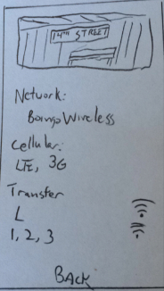
image

Example of a station information page in iteration 2

If you want to try it in POP, here it is!

Project #1: Neill's Subway Adventure, part 2 by Ernie Gerardo

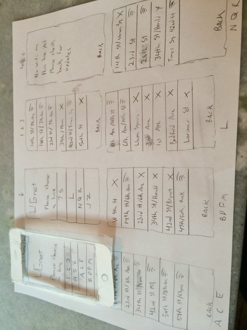
…and welcome to the alpha, kids.  To review, my buddy’s problem is finding a station with WiFi in the New York subway system.  The cruel irony is that if he’s already underground, he can’t look it up.  Until now.  Behold, the paper prototype for UGNet.

image

It’s basically just a database of subway stations that have WiFi, or lines with varying degrees of it.

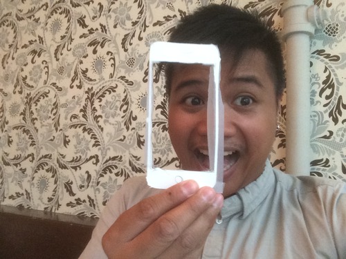
I was especially proud of my little cardstock iPhone.

image

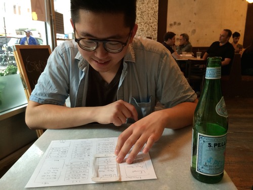
I met up with Neill on Thursday to get his thoughts on my paper prototype.  Due to the rather small scope of the app, he got through it quickly.

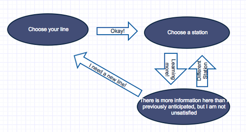
Here’s the basic workflow:

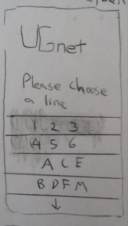
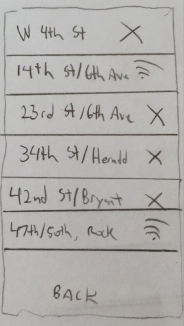
Here are a few more screens of the app:

image Start Screen

image Example of a line with varying degrees of wifi.
image

Having put him through the testing phase, I moved on to having him use it on my iPhone using the Prototype on Paper (POP) software.  No pictures of that right now since he had to use my phone to do it.

In terms of the original goal, expectations have been met.  I’m sure there’s a wider scope I can shoot for on this app, but maybe that can be discussed in class.  For now, UGNet now was a workable prototype.

Project #1: Neill's Subway Adventure, part 1 by Ernie Gerardo

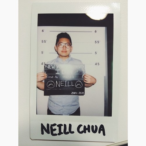
Meet my friend Neill, everyone.  He’s originally from the LA area, and is just getting used to using public transportation as a main method of getting around.  He enjoys french fries and gaming.

He was arrested for drawing frowny faces on his mug shot ID, incidentally.

In this exercise, we were first asked to conduct an interview with our project partners, and then write a paragraph based on our findings.  In this case, I am outlining Neill’s commute to work and school, and any problems he has getting to Brooklyn.  Here’s the finding:

To get to school every day, Neill takes the L train to 8th Avenue, then transfers to the A or C trains to Jay Street/Metrotech.  The whole commute takes him 25 to 30 minutes.  On Mondays and Tuesdays, he comes from work in Chelsea, which puts him at the 14th Street stop on the F train, which puts him in school at roughly the same time.  He has never experienced a delay due to train traffic, but he’s only lived here a month.  He uses Google Maps and the NYC Subway app to learn when trains are coming, as well as if there are any delays or service changes.  If he could, he would drive here, as he hates how sweaty the subway makes him.  By the same token, if it were economically feasible, he’d take a cab every day.

There are a few problems he has with the subway, mainly that he misses driving and not being a “sweaty mess” when he arrives at his destination.  His other problem is that he gets bored on the train.  Given that there’s not a whole lot I can do from a software standpoint about the hot mess problem he has (one day, I dream we will explore deodorizing technology sans-peripherals in mobile platforms), I’ve chosen to address the other problem.

New York is wonderful, in that we are slowly adding WiFi to our busiest subway stations, but you’re never sure where it’s in service.  My proposal for this project is an app that will map out subway stations where there is currently WiFi, and maybe even expand the scope to include stations where there is cell phone reception, although that might be a bit ambitious due to the myriad factors that affect reception (carrier, model of phone, station depth, etc).

Will this make it past the prototype stage?  Stay tuned, True Believers!  Wait, does Stan Lee own the copyright on that title?